So today, capping off a wonkarific week, the ABS released the Labour Force figures.
The skinny is that on seasonally adjusted terms the unemployment rate increased from 5.1% to 5.2%, on trend terms it remained steady at 5.2%. The trend rate has actually been steady for 7 months.
OK. Let’s get to the graphs.
First the “perspective” one. The long term graph:
The, “Hey America and Britain: How you Doing?” Graph
So yeah, things have been worse and are worse elsewhere. But let’s not get too cocky. OK let’s have a closer look at thing.
First the changes in employment:
The seasonal rate bounces up and down pretty drastically, and is useful for looking at corners turning, but the trend shows the picture quite starkly – flat. There hasn’t been a rise (or fall) in employment number of greater than 0.1% in the past 12 months.
Next there is the changes in total hours worked. I won’t bother with the seasonal changes as they really jump around, but a comparison to employment growth shows what is happening.
For the 5th straight month the trend of hours worked has fallen – though the decline is slowing. This suggests that while people are being kept in work, their hours are being reduced. So hours are down, employment flat, why is the employment rate steady? A look at the next graph gives an indicator
The participation rate has been declining since November 2010 when the seasonal rate hit a record 66 per cent.
A look at the employment to population ratio takes into account all things such a whether one is “looking for work” (ie “Participating”) and I think is a better metric than the actual employment rate:
As you can see the trend has been declining in the past 7 months while the actual employment rate has been flat.
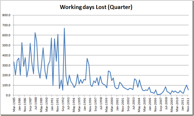
And finally in episode 245 of “Why does the data not conform to our ‘unions are killing the nation’ narrative”. The latest Industrial Disputes figures came out. The number declined from last quarter’s spike (which was due mostly to NSW public servants not covered by the Fair Work Australia Act).
As an aside, given the GDP figures came out yesterday and thus also the productivity rate here’s a graph of the rolling 2 year average of Industrial Disputes and of the GDP Per Hours Worked (Productivity)
Curiously as the number of disputes has declined, so too has the productivity growth. I’m not suggesting a link, but more observing that perhaps the problems of productivity in this country are a bit more complex than just worrying about unions.


Have really been enjoying your insights Chris. The dispersion of the "truthiness" spouted by the business and corporate interests of Australia is a particular favourite.
ReplyDeleteHi Greg, (unless you have changed your name to Chris)
ReplyDeleteMost informative as usual, but one question.
Regarding the unemployment compared to the UK and US graph, didn't Aus unemployment reach just over 8% in 2008/2009 in the middle of the GFC?
Hi Steve. Nope The highest Aus unemployment reached during the GFC was 5.9% (seasonal)and 5.8% (trend) in June 2009. From memory it was forecast to reach 8%
ReplyDelete> There hasn’t been a rise (or fall) in employment number of greater than 0.1% in the past 12 months.
ReplyDeleteI wouldn't be so sure of that. The ABS estimates the unemployment rate using some unrealistically restrictive criteria. Roy Morgan publishes an unemployment rate using a more liberal interpretation of unemployment, consistent with the layperson understanding of what it means to be unemployed. It usually tracks the ABS figure fairly closely in shape if not value, but it has been trending upwards and away from the ABS figures for a couple of years now.
Check it out: http://www.roymorgan.com/news/polls/2012/4742/