My Drum piece today is here – it looks at the rather odd assessment by some in control of our economy that we are “at trend growth”. Bollocks says I.
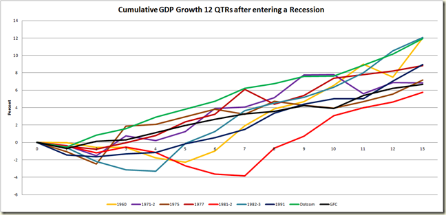
Among the graphs is one that looks at GDP growth after going into a recession.
I only used the 1981-2, 1991, Dotcom and GFC ones as it started to get too confusing with many lines in there.
But here on Grog’s Gamut confusion is not something we worry about, so here is the same graph with the growth in GDP for the 12 quarter after entering a negative period of growth since 1960.
The growth out of the GFC still looks pretty weak.
These graphs take the starting point the quarter prior to entering the recession. The next graph looks at cumulative growth starting from the bottom of the recession. It really highlights the way the economy booms out of some recessions:
Astonishingly, taking the low point as the start, the past 12 quarters have been the worst 12 quarters of growth in GDP post a quarter of negative growth since 1960.
Yeah we’re at trend.
A couple things – look at the 1960 growth – that is a boom. No wonder George Megalogenis refers to the period as “the golden age” in his book, The Australian Moment (by the way – go buy it, highly recommended). Also The second best period if the Aqua line of growth out of the 1982-3 recession. This is a bit of a cheat, because as you can see, the 1981-2 recession was actually a double dip recession, and the blue line takes it's starting point the second of those dips (yeah that’s not complicated). But either way – the mid-1980s were boom-time AUS. Which was nice, given the 1970s had been pretty shite, and the early 1980s were the worst periods of negative growth since the Great Depression.
Also here is the graph again of the decline and eventual rise in the Employment to Population Ratio across all the recessions since 1977. Geez the 1990s were an awful time to enter the workforce.
As a special treat here is the 1991 line by itself with the actual dates, so all you who bought a copy of “Nevermind” and who watched Twin Peaks, Melrose Place and Seinfeld can relive the joys of unemployment:
What is really cool is that when it got back to square in July 200, the Dotcom bubble burst and the went down again and didn’t get back to square until November 2002!
Happy memories Gen X.


4 comments:
In your second graph, if you shift the GFC line by 7 months it would look a lot better.
Did you have a reason for not doing that? (Other than that it would spoil your argument.)
Hi Greg
Nicely explained
I saw in a recent First Dog cartoon that you should be restricted to just 10 graphs per month.
Just think, 2 1/2 weeks each month with no graphs! I don't think that you could cope
Peter - The time chosen was two fold - it has been 12 quarters since the GFC, so in terms of getting data that was as long a period of comparison as I could get, and also I felt 3 years was a good length in terms of seeing any particular trends, and to show the economy without the assistance of stimulus is pretty soft.
Steve S. A 10 graph a month limit is an outrage!!!
This is a bit of a deceive, because as you can see, the 1981-2 economic downturn was actually a twice dip economic downturn, and the pink range requires it's beginning the second of those falls (yeah which is not complicated). But either way – the mid-1980s were boom-time AUS.
Post a Comment