Wednesday, May 30, 2012

Drum Piece: IR, Productivity and the Middle Ground

Today’s Drum piece was on IR and productivity and the desire to be seen as in the middle.

For some reason one of the graphs was repeated and a couple were put in the wrong order. Rather annoying… Thanks to Matt Cowgill for pointing it out to me (much admit I hadn’t bothered to check). Here are the actual graphs in the correct order:

The first graph I used is from the blog, VoteView and looks at the way the Republican Party has gone to the right since 1975.

polar_house_means

The next working days lost figures will be out next week, here’s the ones up till the December Quarter 2011. No doubt if there is an increase, all hell will be reported to have broken lose, economy in ruins, destruction throughout the country etc tetc…

image

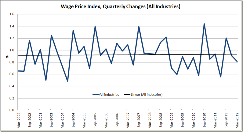
Wages growth is pretty flat. 

image

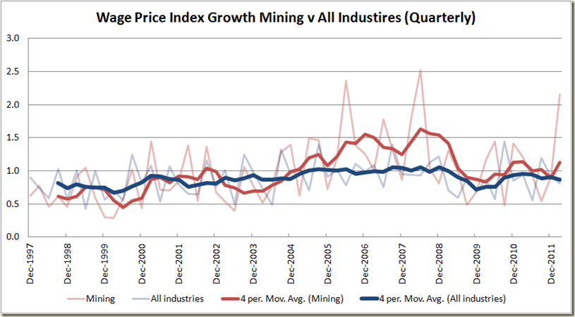
Mining sector increased in the past quarter (though after a couple below trend periods, this is not a shock)

image

Mining wages growth over other industries certainly doesn’t display any real trend of horrors (God knows what was happening in 2006-07 – that must have been when the economy was in a big hole..)

image

Mining might be generating lots of economic growth, but it ain;t doing much towards generating productivity growth.

image

This one comes via Matt Cowgill – National income has risen since 2003 at a much faster rate than GDP. One could suggest one of the reasons productivity growth has not increased is because corporations haven’t needed to worry greatly about it because increases in terms of trade etc have allowed them to make money with less productive means:

image

Corporation certainly haven’t had to worry about declining share of national income since 2003.

image

***

Today the retail trade figures were released. The seasonally adjusted figure was down 0.2%, the trend figure was up 0.3%

image

The big falls were in Departmental and Household goods. Food retailing trade increased.

image

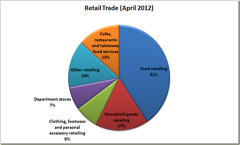
The reason for only a 0.2% decline is because food retailing accounts for 40% of all retail trade:

image

Wednesday, May 23, 2012

Drum Piece: Consumer Confidence

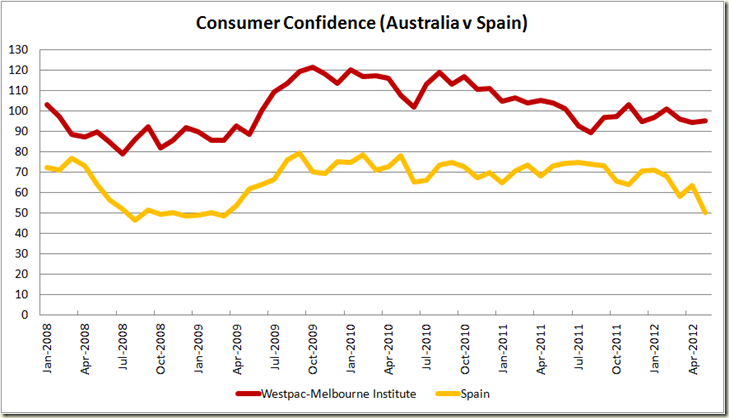
My Drum piece today is on consumer confidence and whether or not it is as important as we suppose.

It is a damn hard thing to demonstrate correlation between it and economic growth, though I’m sure it can be done – with varying degrees of confidence and holding various assumptions. 

I try to avoid too much regression analysis – though it certainly has its place, and just like looking at graphs and seeing what picture is told. Personally rather than look at “confidence” I’d rather more time is spent looking at a variety of measures (including non-economic) such as occurs with the OPEC  Better Life Index. Also we can always have a look at the good old “Misery Index” which adds the unemployment rate and inflation rates together (a lower score means less ‘misery’):
image

Here, by comparison, is the Westpac Melbourne Institute Consumer Confidence Index over the same period:

image

And together:

image

Which perhaps suggests, we’re more confident about our misery now…

Anyhow here are the graphs:

image

image

image

image

image

image

image

Here’s a similar graph looking at a few more countries:

image

image

Wednesday, May 16, 2012

March Wage Price Index: Where’s my wages breakout??

Today the ABS released its quarterly wage price index figures, and once again we found that unions are absolutely incapable of delivering what the right-wing press and Liberal Party expect them to do.

Wages break out? That’d be a no:

image

The Annual Wage Price Index shows the same thing:

image

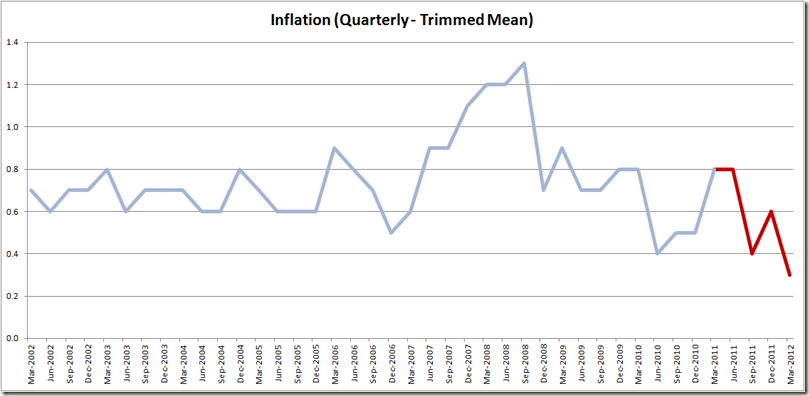
And if we look at the Wage Price Index over inflation, we see an uptick in real terms, but this is due mostly to the absurdly low quarterly rate of inflation – a mere 0.3% in trimmed means terms – the lowest increase since 1998. 

image

Pretty much the worst spin the you could put on it was that the rise was “above expectations”:

The wage price index advanced 3.6 per cent in the first quarter from a year earlier, today’s report showed. Economists forecast a 3.5 per cent gain from a year earlier.

The big wage increase was in mining – not surprising, that’s where the demand for labour is:

image

Mining has shown an increase of late – a 2.2% jump in the wage price index in the March quarter:

image

But as we can see on annual growth terms it is well below where it was in 2008 (ie prior to the introduction of the Fair Work Act), and around where it was in 2005 and 2006. The simple fact is demand does drive wages – and so too do skill shortages. What is important is that wage growth in a booming sector does not lead to growth in other sectors which are not booming. Clearly wages growth in the mining industry is not flowing into other industries.

A year ago the Shadow IR Spokesman Eric Abetz gave a speech to the Australian Industry Group. He said:

The Coalition is concerned that we will see huge levels of wages growth across Australia if action is not taken to ensure sustainable pay increases
….
Such unsustainable wages growth [in the construction sector] will increase inflation, increase the cost of living and increase pressure on interest rates. That destructive trifecta always results in job losses.

The simple fact is Labor has strengthened  the unions’ hand  by expanding right of entry. They have allowed the Australian Building and Construction Commission to be weakened and are now allowing wages growth to spiral out of control.

Abetz must be quite glad that in the 12 months since he made that speech, wages growth in the construction industry has stayed steady – and below that seen from 2004-2009:

image

Used to be a time a “wages spiral” actually led to increased wages…

As for Abetz’s concerns about inflation – lets have a look at how that’s gone in the time since Abetz gave his speech:

image:

Interest rates? Well since Abetz gave his speech the cash rate has dropped a full one percentage point.

And job losses? Well as we we saw last week, the unemployment rate is now 4.9% – below the 10 year average of 5.2%.

Someone should let Abetz know that he can sleep soundly – his worries were just figments of his imagination.

Drum Piece: The Unemployment Rate

My Drum piece this week is on last week’s unemployment figures, and has a look a bit deeper than just the usual big number – using a few bits of data which regular readers will have seen a fair bit of on this blog.

For some reason a couple of the graphs went screwy on the website (or they did for some, but not for others – apparently this is because they’re in jpeg form, so I’ll use PNG or GIF in future) so here they all are in nice size (and crucially you can click on them to get a bigger view – God knows why that can’t happen on The Drum site). My favourite one is at the end, I think it captures the :

The seasonal figure jumps around much more than the trend (not surprise – it’s not meant to)

image

The revision of the trend rate in April shows a rather different picture to what was seen in March

image

Trend employment growth is positive, but pretty weak and flat

image

Participation continues its fall from the record high of October 2010

 image

Hours worked shows four months of positive growth, but has it peaked?

image

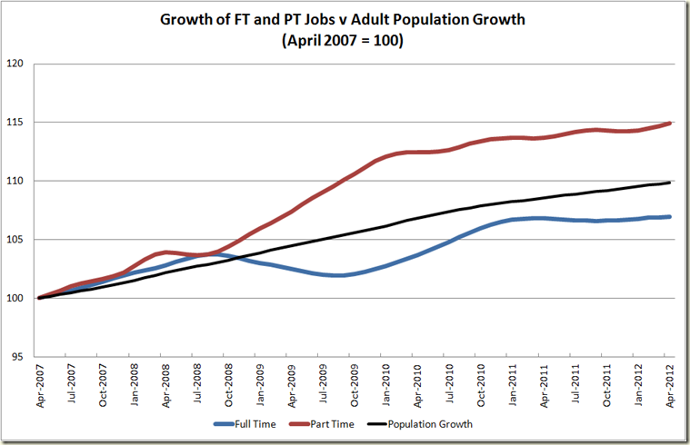
Full time jobs can’t keep pace with population growth (thanks Matt Cowgill – for the graph, not the lack of FT employment, but then he works for the ACTU, so no doubt he and his “wages breakout” are to blame :-) )

image

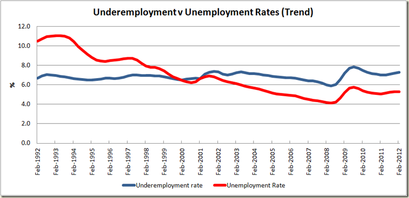
Underemployment is pretty flat, and since 2005 it follows the movement of the unemployment rate.

image

During the GFC the big fall was not in employment as a percentage of population, but hours worked per person – ie cut back in hours rather than sackings.

image

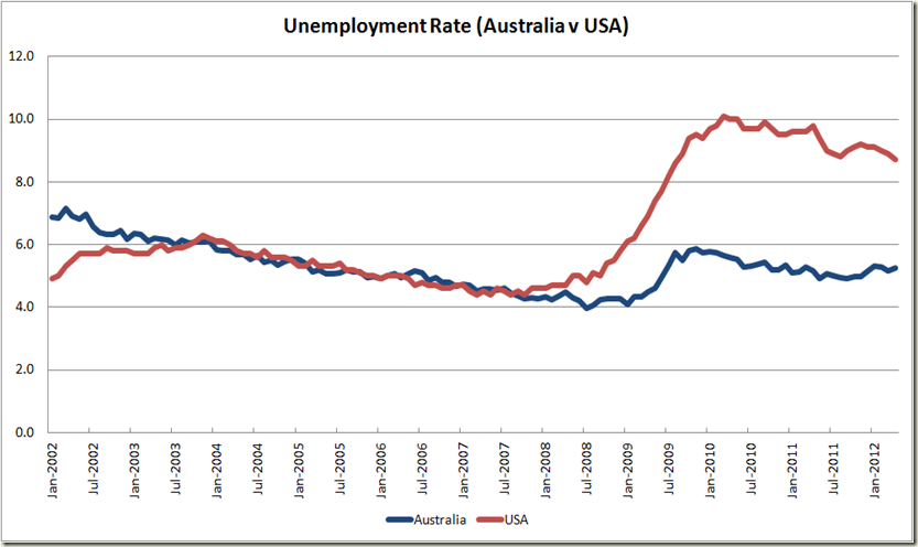
Looking at unemployment rates, you’d think the USA and Australia were similar in the 2000s, and that the USA doesn’t have too far to get back to equal with us

image

Looking at employment to population ratio shows just how different our economies were in the early to mid 2000s, and how big a hole the USA is in. 

image

Plus here’s one other – the Australian dollar is on a serious sliding right now, the red line is the price since the RBA dropped the cash rate on 1 May:

image

Thursday, May 10, 2012

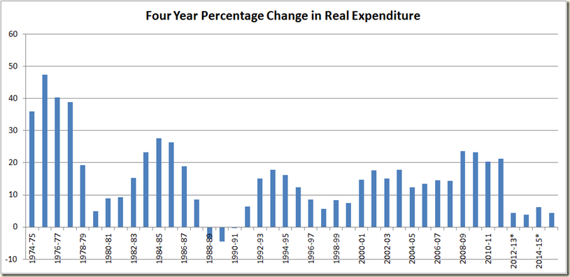
Drum Piece–the budget (billions/millions)

My Drum piece of yesterday was on the Budget (of course).

I made a dumb error with the billion/million on the debt limit. In my original version I had it correctly at 250 billion. Someone on twitter suggested I had made a mistake re billion/million. I was actually at the pub last night having drinks when I read this and so I looked online at my piece and saw “250 billion” which I was sure was right, but I went on the AOFM site to double check and looking on my iphone saw$228,826m” and I quickly and stupidly thought “Oh no it’s an ‘m’!!!”, and so quickly emailed the editor of the site to change it. The million/billion error was actually for another figure (which was corrected).

Auuuuuuuuuuugggggggggghhhhhhh.

An inexcusable error, so idiotically stupid of me.

Please be aware I have slapped myself in the face repeatedly in despair.

Anyhoo here are the graphs.

image

image

image

image

image

image

image

Unemployment rate: Down to 4.9%

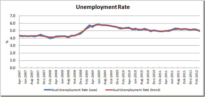
Well that’s a bit of a shock. Today the ABS announced that the seasonally adjusted unemployment rate fell from 5.2% to 4.9%. No one expected this. The trend measure – which doesn’t get as excited as the seasonally adjusted version, came in at a bit more calm 5.1% (in fact exhibiting no change from the previous month):

The drop to 4.9% all sounds pretty stunning, but a look at the rate over the past five years, shows us not to get too excited:

image

It’s been pretty flat since about half way through 2010. And a look at actual employment numbers shows again that we’re not quite in boom time yet:

image

In March there was a big jump in seasonal employment, in April it was less big, thus the trend growth is flattening, rather than going up like it was at the end of 2009.

The ABS also notes: “Employment increased 15,500 (0.1%) to 11,501,000. Full-time employment decreased 10,500 (0.1%) to 8,062,800 and part-time employment increased 26,000 (0.8%) to 3,438,200.

image

A decrease in full time employment is not what you aim for, but the trend growth ensured that hours of work in trend terms increased for the 4th straight month.

image

The decline in full time employment suggest male employment is likely to not be as good as women, and so the figures show:

image

Female employment grew in trend terms by 0.15% compared to males at 0.05%.

The participation rate was basically steady – though it did fall by 0.1% in seasonal terms:

image

And we can see that the trend of the participation rate is yet to suggest that there are more people joining the workforce. This leads to my favourite measure of employment – the employment to total population ratio

image

On this measure the seasonally adjusted improvement is less pronounced – it went from 61.960% (rounded up to 62.0%) to 61.978% (rounded up to 62.0%).

So for all those thinking this result makes a mockery of the RBA dropping rates, I say, the employment sector is not booming, is still pretty flat, and hasn’t got close to returning to where we were prior to the GFC:

image

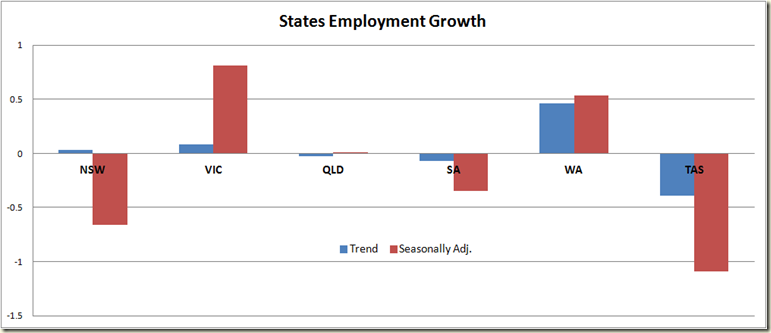
A look at the states also gives us an indicator of how varied the picture is:

image

Barely anything happened in QLD, NSW went down, so too did SA, but their decline was largely cancelled out by the growth in Victoria. Western Australia continues to boom, while Tasmania remains the place where employment goes to die. A look at the growth in employment since July 2010 shows the WA is really the only state growing in a manner that suggests a drop in interest rates was not needed:

image

The Government will claim this as good news (and hell, so it should), there are always issues with the unemployment rate on whether or not it really measures how the economy is going, but 4.9% is a good rate: historically low, and given we also have historically low inflation, the government has every right to crow.

And to end let’s have a look at the “Hey America and Britain, How you doing?”

image

And just in case you think I am being too negative – look at the historical picture:

image

We’re doing well.