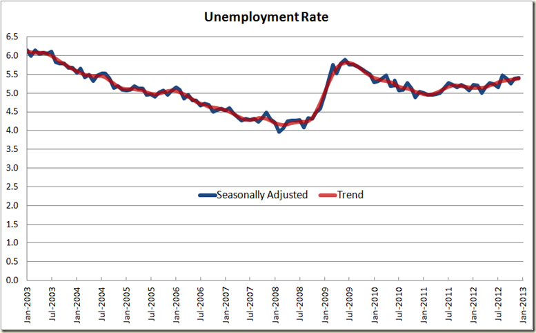
Today the labour force figures for January came out and they had a modicum of good news. The unemployment rate stayed at 5.4%.
The decade long picture shows how long the rate has been bumping around between 5.0% and 5.5% (and seriously, how bizarre is it that a decade ago is now 2003? Surely 10 years ago it was 1995!)
The close up picture of the past 12 months shows the upward movement might (might!) be plateauing, but I wouldn’t put too much in store by that red trend line, for mine there still seems to be an upward trend happening.
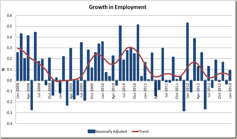
But 5.4% unemployment is still pretty damn good, so let;s not get too down on ourselves. It did come off the back of an increase in employment – in both seasonally adjusted and trend terms. But as you can see that trend growth is still unable to get above 0.1%. And until that happens at best you’re going to see is the rate stay flat, and depending on the participation rate, it could go higher.
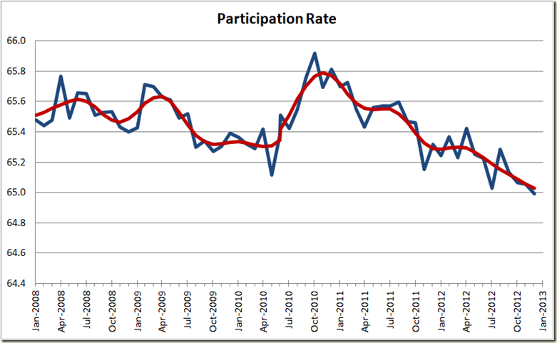
Which brings us to the participation rate. It declined in trend and seasonally adjusted terms – from 65.1% to 65.0 in both cases.
And it has been a long slide from the record highs achieved in late 2010.
The question remains is whether the slide is a structural change reflecting an ageing workforce, or is it merely a symptom of the weak labour market and we one day will get back up to near 66% (my gut says no).
In hours worked in trend terms we see an ever so slight decline (there was as well in seasonal terms), but the boarder picture is the weak growth in hours worked since that late-2010 time. We might be at a historically good unemployment rate, but that doesn't mean the labour market is purring along. It’s pretty weak. It’s amazing how well it’s kept up really.
The weakness can be clearly seen when we turn attention to Full-time labour. Trend growth has been negative for 3 straight months. Not good at all:
Interestingly the unemployment rate of those looking for full-time work is coming back to the overall rate. Perhaps reflecting that people are giving up looking for full-time work and looking for anything they can get:
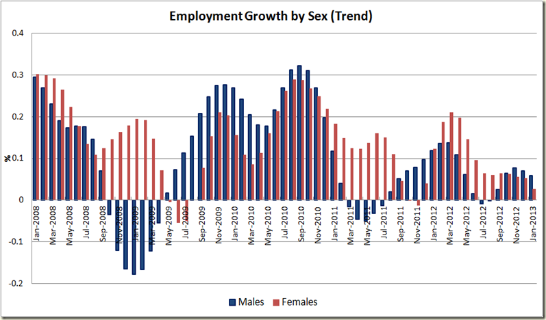
As to the sexes, both men and women are doing roughly the same. Not great but just keeping in the positive:
Now in the past few months the picture from Queensland has been fricken dire.
The austerity of Campbell Newman’s government has slapped the labour market in the sunshine state around somewhat (and by “somewhat” I mean in the sense of “I got hit in the head somewhat last night and had to call for an ambulance after I passed out”).
So it is only right that I point out the good news that this month in seasonally adjusted terms QLD had a win.
But as I’ve always noted as well, seasonally adjusted terms are pretty dodgy at the state level (after all back in October last year Tasmania was the “boom state”). But even in trend terms QLD had a good month. Coming 3rd behind WA and SA.
If we look at the longer term picture of the yearly employment growth we get more of a sense of why one good month of employment growth in QLD sure as heck ain’t time to pop open the West Coast Coolers and start partying like its the 1980s. As you can see of the top 3 growth states of January, only WA is really showing any signs of long term growth.
As noted above the participation rate has been a key for keeping the employment rate steady. This is also a factor at the state level.
QLD’s participation rate is second only to WA’s, but it has fallen drastically in the past 15 months.
If we look at the state participation levels since the Later 2010 period, we see all but WA have shrunk, and QLD has shrunk by far the most.
All this leads to a continued decline in the employment to population ratio. We’re a long way from the record achieved in early 2008:
And if we look historically at how the employment to population ratio has declined and risen during past recessions, you can see not only how weak the recovery post GFC has been, but also how structurally changed the current situation is.
The decline from the peak prior to the recession post the GFC (and yes I know there wasn’t technically a recession) is now longer than that of the 1981-82 recession. And our economy is sure as hell a lot better than it was then. The difference then was women came into the labour market in greater number than ever before.
We don’t have any untapped source of labour this time round, and actually the tap is turning off as the population ages.
It certainly makes for an interesting policy period for those pondering the economy.


Hi Greg,
ReplyDeleteHave you considered how much of the change in the participation rate has been the result of the increasingly retired baby boomers, as well as increased numbers of uni and tafe students?
The ABS headline statistics are based on the 15 and up age groups, but by some of the tables have age restricted information. The closest to prime working age people from the figures are 25-64 age range which can be extracted by subtracting the 15-24 populations from the 15-64 populations and then recomputing.
Based on those figures, the seasonally adjusted participation rates are still stable at about 78-79% where they have been since 2008.
That's not to say that the prim working age participation to populaton ratio hasn't worsened down by about 1/3rd of a percent over the past 6 months or so.
But with prime working age unempoyment rate still at 4.1% or so, that's still lower than during the 2008 GFC or before the surge of the mining boom "back" in 2004 and earlier.
Great post.
ReplyDeleteThere's a lot of carry-on in Victoria right now about how the latest figures ("30,000 jobs lost in January") reflect work for the building industry drying up. It's unclear to me if this is really the primary sector behind these falls or if it's more of a political point.
Do you have any thoughts?
Anon I'm pretty sure that is why there has been a change in the participation rate. It;a why i think we have peaked on both that and the employment to population ratio
ReplyDelete