Today’s labour force figures demonstrated that sometimes economics is not about “good news and bad news”, sometimes it’s just all bad.
There really was nothing in today’s figures that holds any joy. But let us gird our loins and venture into the data.
Firstly the unemployment rate both seasonally adjusted and trend stayed at 5.8%
It was pretty close to 5.9% though. The seasonally adjusted rate came in at 5.845%, so about a hundred fewer jobs and the rate would be 5.9%.
But that said the trend rate was 5.79% which is a rock solid 5.8%.
A couple months ago I was hoping a bit of a plateau was beginning to appear, but alas, when we go in for a close-up the upward direction appears to continue:
The worst thing was this month employment actually fell. In seasonally adjusted terms employment decreased by 22,600, or 0.19%. As you can see the seasonally adjusted measure jumps around a bit, but even the trend growth was negative (just):
In annual terms things are still positive:
But that is small consolation, especially if we have a look at the past 20 years, and we see it is almost as bad as it was during the GFC, and only the 1990s recession had it worse:
And if we look at the 5 yearly jobs growth over the past 30 years, the picture isn’t much better (out of interest to get to a million jobs in 5 years, it’d need to get up to around 8.5%):
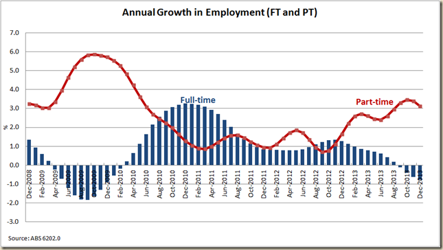
But the big problem is any job growth that there is, is in part-time work. On Twitter I posted a 3 year version of this graph, but here’s a 5 year one to give broader context – and what occurred during the GFC:
The drop in full-time work is not quite as bad as it was during the GFC (in trend terms at least), but it ain’t healthy at all:
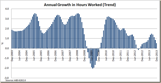
Not surprisingly growth in hours worked is starting to go down, and when that goes negative you know we’re in bleak territory.
In 2012 the hours worked grew much slower than actual employment – suggesting an increase in part-time work and also more work being cut back than laid off. Now though they’re together:
As a result the growth in hours worked per person is also starting to decline after a bit of an increase in the middle of 2013:
This all adds up to an increase in the rate of people looking for full-time work:
After a slight decline in the gap between these two rates in the middle of last year, it has again widened. It’s not quite at the gap it was during the GFC, but neither does it seem to be peaking.
The employment to population ratio is also awful:
If we look at the historical view you can really see that a turning point happened in 2009-2010:
Most of this is due to the ageing population (I doubt we will ever see the 63% level again), but if you compare the total ratio to that of just 15-64yo you can see even percentage of those in the working age who are employed has also fallen (though this is also due to an increase in 15-24yos staying in education)
I might do a post on the states tomorrow, or I might save it for my next Guardian post because there are some interesting aspects when you break it down to state level, but I’ll leave you with this one graph which shows that Victoria now is the biggest anchor on the unemployment rate:
All in all, bleurgh. Who knew that a government coming in and saying they're open for business wouldn’t get turned around straight away. These figure aren’t the Liberal Party’s though. But the time to lay the blame on the ALP is fast running out for Hockey and Co.


1 comment:
What a graphical representation you are giving. Thanks for sharing this useful information.
get more instagram followers
Post a Comment