Well now. What an interesting set of numbers. Have had a bit of a long day, so there’s a stack of graphs, but the writing is at a minimum.
Today the ABS released the March labour force data and we see the unemployment rate rising to 5.6% in seasonally adjusted terms and steady at 5.5%. I say “steady” because last month it was 5.4% (or 5.388%), this month the February 2013 trend figures has been adjusted to 5.5% (or 5.455%)
The headline figures comes off the back of a fall in total employment in seasonally adjusted terms of 36,100 or 0.311%. This makes it the biggest fall since March 2003
Which is rather interesting since February employment growth figures were the strongest in nearly a decade:
Now a month ago when those figures came out everyone was pretty sceptical about them- and expected some adjustment to occur. And adjust the figures they did. They adjusted them up
So it’s not that the February figures were wrong, it’s that there seems to be a fair bit of volatility in the figures at the moment. It might be the case that the seasonally adjusted data is carrying on like a teenager who has just started drinking Red Bull with raspberry cordial chasers. Perhaps it’s time to go trust Mr Trend who is rather more sedate – sedate like an old stoner whose just slapped on a Bob Marley record and has popped down in a bean bag to chill man.
Speaking of chilling. Let’s look at the annual growth rate over the past 10 years. As you can see clearly, we got out of the GFC without going backwards in any year, but after 2010 finished things went downhill fast, and since 2012 began the upswing has been rather cool:
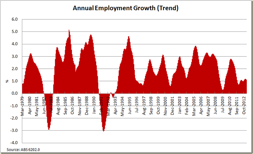
Look at the past 30 years to get some perspective:
We’re certainly not in recession territory, but you can see that the periods where the 1% growth line is visible is not a sign of health, and we’re just above that.
OK. Here’s the unemployment rates in the past 5 years:
Certainly seeing a bit more *up* in the formerly flat line from September 2010. But let’s go in for a closer look. Last month I said of the 12 month graph:
“Is the “flatness” a plateau or the top of a summit?”
Well that flatness ain’t really there anymore:
So let’s now look at the participation rate – last month there was a big spike. This month the spike has been reversed (and the trend rate stays at 65.1% where it has been since September 2012):
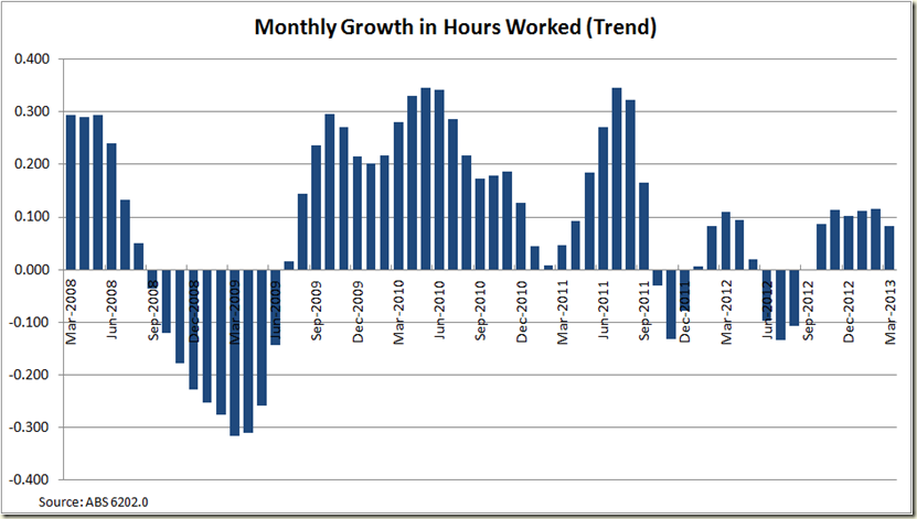
Now onto the hours worked. The seasonally adjusted figure went down a touch but as usual I’ll focus on the trend growth:
The interesting aspect for this is productivity for the March quarter. As productivity is GDP per hours worked, and as growth in hours worked was pretty much the same in in the December quarter (as you can see the last 6 columns are pretty much the same), it suggests if GDP grows by as much as it did in the December quarter – which was a mere 0.6% then productivity should again be pretty solid. We wait and see what those March quarter figures hold (don’t hold your breath though, they only come out on the 5th June).
There was a drop in full time employment this month:
There was also a drop in Part-time employment. This was the big aspect that led to the overall drop in employment. The seasonally adjusted figure certainly does jump around , so looking at the flatish, but positive trend term makes it easy to gauge what’s going on:
And now if we compare the unemployment rate with that of people looking for full-time work we see a pretty constant move up since March 2011, and a big jump in those looking for full time work last month:
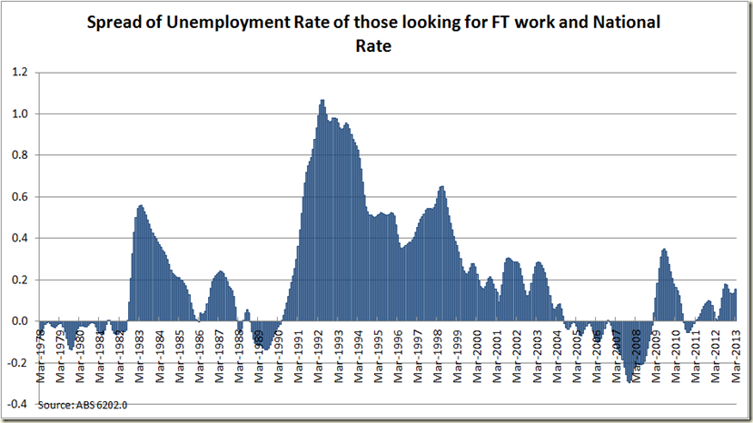
When you look at the difference between the 2 rates (in trend terms so things aren’t so jagged), it’s clear that the more the rate of those looking for full time work goes above the total rate, the more the economy is in trouble. We’re not “in trouble” yet, but you wouldn’t want to gap to get any closer to the 0.2 percentage points:
And now to add a bit of sex to economics... who did the best last month?
Women. Just.
The employment to population ratio continues it’s sad tale:
That ageing population combined with a pretty weak labour market is not doing good things on this score.
Now to the states:
As ever the seasonally adjusted can be erratic
So let’s look at the trend data instead:
Looking good for QLD and NSW, but not great for WA! Whaaaat??
So let’s see the annual data:
That looks a bit more sensible.
And now the the unemployment rate minus each state.
Queensland remains the biggest drag on the national account:
And that’ll do use for another month. Not great – 5,6% is certainly above where you’d like to be, but the trend of 5.5% at least gives us some hope that the March figures were just a bit of a blip to go along with the opposite sided blip in February.


1 comment:
A bit of a blip perhaps, but as you note the trend appears to be upwards.
Post a Comment