Over the weekend came the great news that Aussie crime flick, Animal Kingdom (which I wrote about last week) was awarded the Grand Jury Prize for Drama (for non-US films) at the Sundance Film Festival. This is a huge honour, and as far as I can find, the first time an Australian film has ever won anything at Sundance (Harvey Krumpet got an honourable mention).
Today however I saw the “teaser poster” for the film:
I have to say I’m not impressed. It was done by Australian Jeremy Saunders who also did the poster for Balibo that I gave a bit of a bollocking to last year.
This one I think is even worse. Much worse in fact because it gives no idea what the film is about.
That it needs to have written “A Crime Story” down the bottom is absolutely shocking.
In the reviews from Sundance, the Animal Kingdom has been compared to films by Martin Scorsese, Michael Mann, Quentin Tarantino and Francis Ford Coppolla.
Does this look like the poster for any film done by those directors?
Just look at the picture. What is the film about? Does it scream gritty underworld crime flick? Does it scream – if you like Martin Scorsese or Tarantino go see this film?
Does the answer “hell no!” spring to mind?
I’ve read the reviews, seen the trailer and I still can’t work out what this poster means. And it sure as hell doesn't make me want to go see the film.
Saunders actually can do some great posters – I love his posters for Romulus, My Father and Samson and Delilah. But in my opinion this one just fails in its job – which is to get people wanting to see the film. Take a look at the Romulus, My Father poster. The film is a very emotional drama about migrants in Australia but it is also about the bond between the father and son. Here’s the plot outline given on imdb.com
It tells the story of Romulus, his beautiful wife, Christina, and their struggle in the face of great adversity to bring up their son, Raimond. It is a story of impossible love that ultimately celebrates the unbreakable bond between father and son.
I have to say the poster absolutely nails it. There is just an amazing vibe of the father-son bond in the poster that makes me want to go see the film, even though I know it may well at times be pretty heavy going, because I know at its heart the film will be about the love of a boy for his dad and vice-versa.
But Animal Kingdom? It gives no vibe. What or who are the people above the “animal”? They could be anyone doing anything.
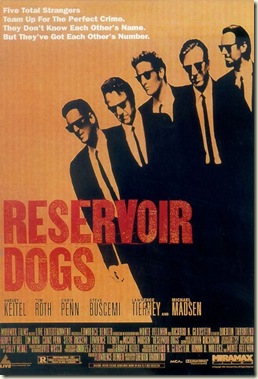
Compare it to the classic posters for Reservoir Dogs and Goodfellas:
They’re both all about the vibe. You have got a pretty good idea of what you’re getting – and they ain’t family films.
Try some other absolute classic crime-film posters:
All of them let you know if it’s the type of film you want to see – the Heat poster, while not the greatest design ever, absolutely captures the coldness of the film. The Miller’s Crossing one is perhaps too subtle, but I love it (as I do the film). And The Usual Suspects poster is pretty much as good as it gets.
Marketing is so important. Animal Kingdom looks to have everything a film needs to do well at the box office, I just hope they don’t blow it through bad marketing – with a name like Animal Kingdom, they already have to make sure the prospective audience doesn't think it is a wildlife documentary. And names matter – my sister has a very good theory that if people don’t understand the name of a film it will die at the box office – eg The Road to Perdition or Invictus. No one wants to see a film that they had to look up in the dictionary to find out what it is about. Animal Kingdom is a good title, but they better not play artsy-fartsy with it – instead get it across to the audience that the animals are crooks and cops. The last thing they want is another version of The Square. That was an Aussie crime flick/thriller from 2008 that also starred Joel Edgerton; it too got excellent reviews, but then totally stuffed up the marketing and distribution and ended up making a whole $321,000 at the box office. That is not what is known in the industry as a success story.
Now ok, it’s just a teaser poster. But a good teaser poster can get your mouth watering. The best ever teaser poster for me was that for The Phantom Menace:
The poster conveys everything with just one brilliant use of shadow (in fact the main problem with the film is that it didn’t follow through on the message conveyed in the poster).
So here’s hoping they do get it right with Animal Kingdom (it opens May 6).
***
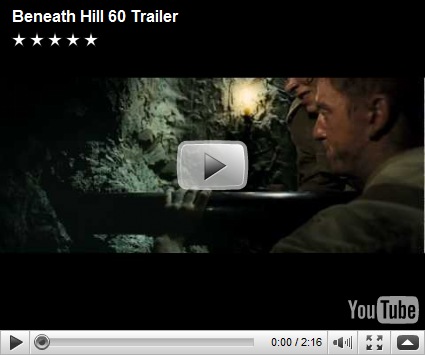
On another tack, over the weekend saw the release of the trailer for the Aussie WWI film, Beneath Hill 60.
It’s a pretty standard trailer – sets up the story well and I think hooks you in nicely.
Now I never met a war film that I could resist, so I am looking forward to seeing this one (it opens on Anzac Day). The last war film done in Australia was Kokoda, which took a smidge over $3 million.
Here’s hoping Beneath Hill 60 does that and more.


2 comments:
Hi Grog,
I love the Animal Kingdom poster. It's a festival poster and therefore aimed at a small pool of cinephiles who, paradoxically, have a larger pool of films to choose from than the average punter who will probably never see this poster. The very fact that you felt moved to devote a blog to it must mean it's gone some way to doing its job. That said, unlike the Antichrist poster, I don't think this poster was designed to be controversial. Calling a "crime story" Animal Kingdom makes me think the film will be much more than a crime story - that it might be about wider society or say something about human nature. Juxtaposing the image of snarling wolf jaws with the text "A Crime Story" makes me think that maybe Animal Kingdom, like Heat or Goodfellas, might not just be a good plot driven cops and robbers drama, it might actually have something to say. And that might make it great. And I get all that from the poster!
Hi Sophie
I didn't think the poster was controversial. I thought it was bland!
After seeing the teaser trailer I coudln't wait to see the film. After seeing the poster I thought, hmm doesn't seem so good now.
Aiming at cinephiles? Gee I hope not. Festival or not, marketing a film starts early; if they're aiming at cinephiles they're starting with a very narrow base.
I also hope the film is not going to try and say more about society (human nature is a bit different). And if it does I sure as hell hope it is subtle. Nothing kills a film more than a sincere message about society.
I just hope it tells a damn good yarn, and that it gets a big audience.
The Antichrist poster was a cracker.
Post a Comment