Thursday, November 7, 2013

October Employment Figures (some more graphs)

From my Guardian post I have start using Datawrapper for the graphs. They are a bit more interactive, though pretty basic. I actually prefer just using Excel for some graphs, especially when I am using 2 Y-axis, or I want to combine columns and lines on the same graph.

But here are a few graphs with Datawrapper:

I might use these a bit more in future

A different version of the above

Australia’s unemployment rate rises to 5.8%, or steady at 5.7% (take your pick)

The Monthly labour force figures came out today and they do little to suggest the Treasury's prediction of 6.25% by June next year will be wildly inaccurate.

In seasonally adjusted terms the unemployment rate in October stayed flat at 5.7%. Although given September’s rate was 5.6755% and October’s was 5.7442%, it was all down to rounding that kept the rate flat when in fact it increased 0.068 percentage points.

In trend terms, the rate rose form 5.7% to 5.8%. But here again rounding is at work. The trend rate in September was 5.74% and in October it was estimated to be 5.75%. So as a result of rounding it increases up from 5.7% to 5.8%, but in reality it only increased by 0.0106 percentage points.

So the seasonally adjusted version shifted by more than the trend measure but the trend rate “increased” while the seasonally adjusted rate stayed “flat”.

Don’t you just love economic statistics?

At this point we should remember these are estimations. The seasonally adjusted rate for example sees the ABS being 95% confident that the rate shifted somewhere between in falling 0.3 points and rising 0.5 points.

But that statistical rhubarb aside, let’s get to the graphs:

First the 10 year picture finds us back where we were 10 years ago. Now back then being below 6% was seen as an economic wonder. Now if it were to stay at 5.8% there would be grumbles about a weak economy (and reasonably fair enough).

image

The close-up 18 months picture has us aching to see a plateau. It does however highlight that we haven’t quite got the the 5.8% mark yet, and for use to get to 6.25% would require a speeding up of unemployment as was seen after the brief semi-plateau observed at the end of 2012:

image

But the story today wasn’t so much about unemployment as employment. The number of jobs in trend terms fell 0.036%

image

And it makes for a pretty ugly annual growth figure. Employment growth is heading back to the level we saw during the GFC. Who knew it took more than just saying “Australia is open for business” to get people hiring workers?

image

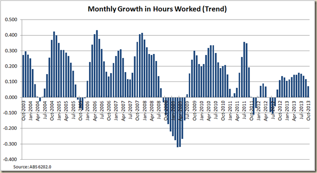
Although intriguingly the hours worked in the month increased:

image

But it appears to have peaked in annual growth terms:

image

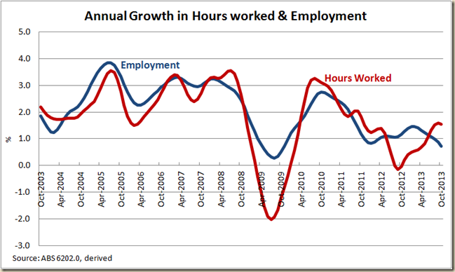
And when we compared growth in hours worked with growth in employment it seems that perhaps this peak of growth in hours means the disconnect between the two measures that has occurred since mid-2012 is about to end

image

It also means for the first time in 6 months the monthly hours worked per worker did not increase in October

image

But while the story of the labour force figures was the lack of job growth the really interesting part of that story is the breakdown of full-time and part time employment growth:

Trend part time jobs in October grew (just) while full-time work fell for the 6 month in a row.

And this meant that for the second month in a row there are now fewer full-time jobs than there was 12 months ago:

image

The drop in full-time work has hit men the hardest:

image

But lets compare the FT/PT growth by gender:

image

For men the growth in part-time work is quite dramatic, for women it’s pretty standard:

image

Not surprisingly the lack of full-time work for men has kept the gap between the unemployment rate of those looking for full-time work and the overall figure at pretty ugly highs.

image

What is also concerning is that while yes you can blame some of the fall in participation on the ageing workforce, the percentage of 15-64yo in employment continues to fall (though again some of this can be attributed to the decline in youth employment due to them staying at school longer now. I really wish the ABS did a monthly 25-54yo breakdown to get “prime working age” figures – and yes I can work it out using the “detailed” figures that will come out next week, but geez, that requires work!)

image

For me though an interestingly little nugget I discovered is that for the first time in 30 years the proportion of women employed (15-64yo) is less than it was 5 years earlier:

image

After the surge of women into the workforce in the 1980s and the continual strong growth during the late 1990s and first part of this century the growth it has fallen rather dramatically. For an economy that has thrived on the increase in participation of women this might be the big issue – ie not just ageing, but have we reached the peak level of women workers? Is two-thirds of adult women working the highest we can get?

My guess is that while more women-friendly work places and the breaking down of discrimination has led to the increase in women working – mostly in part-time work. For the number to go any higher would require, I think, some fairly major changes of culture in terms of which parent stays at home.

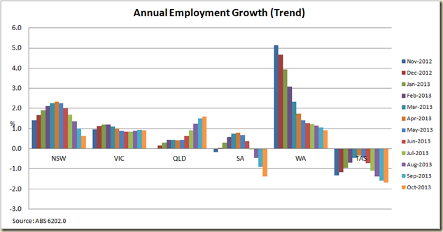
Finally a quick look at the states. And break out the champagne you austerity champions, QLD has had the strongest employment growth of the past 12 months:

image

A look however at the past year suggests its position is due to a nice pick up in QLD and a big fall in WA and NSW. But at least QLD’s unemployment rate remains steady at 5.9%. Good news:

image

Thursday, October 10, 2013

Australia’s Unemployment Rate steady at 5.7%

Today the ABS released the latest labour force numbers. I haven’t done a full post on the number for a couple month due to the election, so let’s have a look and see how we’re doing.

First off, the numbers scream “ignore the seasonally adjusted rate”. On seasonally adjusted terms the unemployment rate in September actually fell from 5.8% to 5.6%.

But come one. Really? Maybe it’s the big turn around, but given the IMF on Wednesday thinks we’re looking at a 6.0% unemployment rate next year (and Treasury is gloomier still, thinking 6.25%) I’d bet no.

In trend terms – which is always much better when it comes to comparing changes from month to month, it stayed flat at 5.7%.

And anyway if we get down tot he nitty gritty, the seasonally adjusted figure in August was 5.7647% so it only just got rounded up to 5.8%, and September’s number was 5.6479%, so it only just got round down to 5.6%. Thus while it looks like a 0.2 percentage point drop it’s really only a 0.12 percentage point drop.

So I’m going with the 5.7% flat rate as more believable.

OK, the 5 year picture:

image

We’re not quite back to where we were during the GFC, but the path back to 6.0% has been pretty steady since mid 2012.

So let’s go in for our 18 month close up:

image

A steady rise, but and ever so slight suggestion of a plateau. I think that plateau depends a fair bit on whether or not this month’s figures get revised a bit next time round.

But that’s the big number, let’s flip open the hood and have a bit of a squirrel around and see what is really going on.

First, monthly employment growth:

There was an increase of 9,100 jobs in seasonally adjusted terms, but employment actually fell in trend terms:

image

Either way, it’s pretty soft (and by soft I mean fricken weak) as the annual employment growth rate really shows:
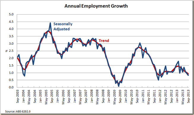
image

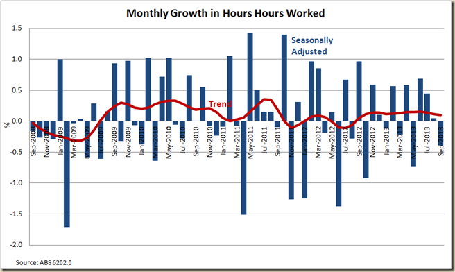
The hours worked measure is also interesting. In seasonally adjusted terms it fell (even though the amount of jobs increased). But in trend terms it has been increasing for the past 12 months:
image

This translates into an annual increase in hours worked that seems a bit at odds with the employment picture:

image

But it makes more sense when we look at what has happened with both over the past few years:

image

Here we see is that in 2012 hours were cut back, but employment continued to grow – through hours of full-time work being reduced, and/or the growth in part time work exceeding full time work. It is not too bad a thing really – much better for hours to fall than for total jobs to – it is always easier to increase hours than to go from no job to a job (and also a sign of a nicely flexible IR system).

Now we see a bit of a counter balance. Clearly the economy is not going gang busters, but where work is able to be increased it is being increased through either shifting part-time workers to full-time, or increasing the hours of full-time workers.

I would suggest the space between the total employment growth line and the hours worked bars from June 2012 to July 2103 exhibits a lot of spare capacity in the labour market of those already employed.

I would suspect that the hours worked growth will need to stay above the employment growth for a few more months before we have any chance of seeing a good increase in employment.

As a result the Hours worked per employed has now risen for the past 6 months, but is still well below pre-GFC levels:

image

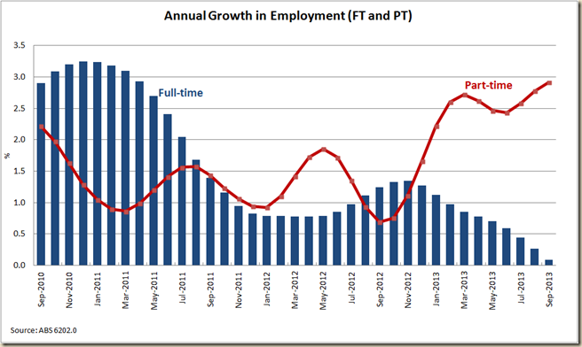
So there is some employment growth but not much, and what there is, is mostly part-time
image

But even the part-time employment growth is slowing as can be seen pretty starkly when we compare monthly full-time and part-time employment growth:

image

Not surprisingly the unemployment rate of those looking for full-time work remains well above the total rate:

image

The gap has narrowed a bit, but looking back over the past 10 years, we see the gap is as big as it has been outside the GFC period:

image

The Participation Rate has received a fair bit of attention today, and not surprisingly because it has rather dived in the past few months:

image

Now it is always worth remembering that the participation rate can fall for a couple reasons. The first is the most obvious – people have given up looking for work. But the second is why they have done that. For some it is due to despair, for other it is due to age.

The ageing of the population remains with us, and I seriously doubt we’ll see a participation rate ever again at the near 66.0% that it reached in late 201o.

Indeed a look at the past 20 years suggests 2008-2012 was a abnormal level rather than the expected to be norm.

image

One thing to note is that since November 2010 the total participation has fallen 0.8 percentage points, but the 15-64year old participation rate has only fallen 0.3 percentage points in that time.

People are getting old, more than people are getting discouraged. For a better look at the ageing dynamic, Matt Cowgill has some excellent graphs on it all. My very quick and dirty look at the impact of the ageing of the population is to compare the change in the total employment to population ratio and that of 15-64yo since April 2008 (the peak level).

image

While during the GFC the both rates fell and rose around the same, since the end of 2010 the total rate has fallen faster. And as we know 2010 minus 1945 is 65 – or the beginning of the retirement age for baby boomers.

(I really should use the 25-54 age bracket, as what we’re also seeing now is that 15-24yo are staying in school/uni/TAFE more than they sued to, which is also reducing the total rate somewhat).

OK, now onto the growth of employment for men and women. Usually I look at total employment, but let’s just look at full-time work:

image

For the first time since the GFC period, annual male full-time employment fell in the past 12 months. While full-time employment for women is holding up, growth has moderated in the past 12 months.

Not a really wonderful picture of economic health. Yes the unemployment rate went down, but let’s not get too excited, when full-0time work numbers start picking up, then we can begin to say the corner has been turned.

Tuesday, September 10, 2013

Election 2013: The Newspapers

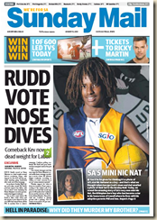
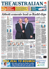
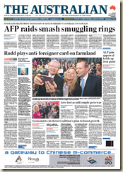
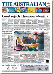
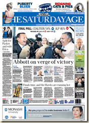
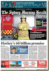
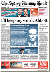
During the election campaign, most mornings, the first site I looked at was the Press Display to see what the front pages were like.  Obviously they were mostly awful. But for future reference and for your edification here are the front pages of The Daily Telegraph, Courier Mail, Herald Sun, Advertiser, The Oz and Sunday Version thereof of every day of the campaign when the front page had a story about the election.

Press daily didn’t used to show the front pages of Fairfax pages until a couple weeks ago, so I only have the pages of The SMH and The Age for the last two weeks.

First The Daily Tele:

I make it 10 pro LNP stories, 11 anti-ALP stories, and 1 sort of pro-ALP (the ALP launch which still had a kicker for Rudd in the headline about Abbot “surging)

DT 1DT 2DT 3DT 4DT 5DT 6DT 7DT 8DT 10DT 11DT 12DT 13DT 14DT 15DT 16DT 17DT 18DT 19DT 20DT 21DT 22DT 23DT 24

The Herald Sun had a lot less coverage. Mostly this is because there were less critical seats in Victoria, and also because Essendon dominated the AFL town. I make it 7 pro-LNP sotries, and 3 anti-ALP. 

HS 1HS 2HS 3HS 4HS 5HS 6HS 7HS 8HS 9HS 10HS 11HS 12

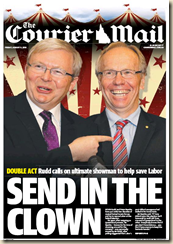
The Courier Mail is another story. Like the Daily Telegraph and Sydney, there were lots of seat sin the QLD that the Liberal Party wanted to win. And so too it seems did the Courier Mail want them to be won.

I’ll rate the first as neutral. But from then on it’s 12 anti-ALP, and 2 pro-LNP.

CM 1CM 2CM 3CM 4CM 5CM 6CM 8CM 9CM 10CM 12CM 13CM 14CM 15CM 16CM 17CM 18CM 19CM 20CM 21

The Advertiser, like the Herald Sun was in a state with few seats expected to change hands. So it wasn’t as big an issue. The Tiser was the most balance. It found room for one pro-ALP article (with a slight slap in the headline). Only 2 anti-ALP ones and 5 pro-LNP

Tiser 0Tiser 1Tiser 2Tiser 3Tiser 4Tiser 5Tiser 6Tiser 7Tiser 8Tiser 9Tiser 10

The Sunday Papers were pretty one sided:

8 anti-ALP, 3 pro-LNP (not including the ones the day after the election)

SDT 0SM 0SM 1SHS 2SDT 1SM 2SDT 2SM 5SM 6SDT 3SM 3SHS 3SDT 4SM 4SM 7

The Oz is tougher to score. Multiple headlines, and often good stories below the fold disguised by misleading headlines:

Oz 1Oz 2Oz 3Oz 4Oz 5Oz 6Oz 7Oz 8Oz 9Oz 10Oz 11Oz 13Oz 14Oz 15Oz W 1Oz 16Oz 17Oz  18Oz 19Oz 20Oz W 2Oz 21Oz 22Oz 23Oz 24Oz 25Oz W 3Oz 26

The Age is also tough. The headlines are much less emotive than the news.corp

Age 1Age 2Age 3Age 4Age 5AGe 6Age 7Age 8Age 9Age 10Age 11

The SMH is much the same as The Age

SMH 1SMH 2SMH 3SMH 4SMH 5SMH 6SMH 7SMH 8SMH 9SMH 10SMH 11SMH 12SMH 13

So there you go. That was the election 2013 from our unbiased media…