Wednesday, March 20, 2013

Drum piece: Plus a look at Australian and USA’s GDP over the years

My Drum piece today looked at a few things about our economy and how it is going compared to the rest of the world, and also how we seem to be getting just a bit more confident.

This of course doesn’t mean we’re never had it so good or any such guff, but that given the high dollar and the continuing crapstorm happening in Europe and America;s sluggishness, we seem to be holding up ok.

Last week I showed a few graphs about our GDP growth compared to the USA, and someone asked how it has gone since we last were in a recession, so because I can’t turn down a request to do a graph here it is:

image

It serves to reinforce the message that avoiding the slump of the GFC was a big deal. Sure our mining boom increased our lead over the yanks, but what really put us in front was them falling off the GFC cliff, and even earlier their stumble during the Dotcom bubble bursting in 2000. You can see from 2003-2007 we do grow slightly more than does the USA, but the big difference occurs 2008-09.

Or to show that graphically, here’s the difference between our cumulative GDP growth since 1991 and the USA’s:

image

The boom (and their stumble from 2000 to 2007 did gives us a lead. But nothing improves your relative performance like  the other nation falling head first into a big pile of economic poo.

But hey that’s 20 years. How about 30 years? Let’s go back and see what the picture looks like if we include the big boom of the 1980s and our 1990s recession:

image

We both were hit by the early 1980s recessions, and again in the 1990s we were in the same boat. What you can also see in the 1990s recession while both nations slid a bit it was more about staying flat for a period than going right backwards. The GFC is a different fish altogether.

And again the spread:

image

OK look, I’m boring you here with all this short time stuff. Let’s go back to 1972. 40 years worth of context:

image

Now we’re really starting to se the big picture. Up till 2000 we were in lock step with the USA. They were hit by the Dotcom recession, we narrowly avoided it (because Costello sensibly let the budget go into deficit (though he kept it quiet when he did it), and then our mining boom began. Now by the end of 2007 we were looking pretty damn good. Our boom had put us nicely ahead – 10 percentage points – in effect it took from 2000 to the end of 2007 to put us 10 percentage points ahead of the USA in cumulative growth terms. But look where we are now. 

image

So all in all I think we can say, however it happened, and for whatever reason we did, we shouldn’t be bitching about missing out on the GFC. We should smile and get on with it.

One final thing. A lot is made of the “great moderation” that has occurred post the 1990 recession, and how we have avoided a recession. But we’re also avoided big booms of GDP growth as well. For example in the 1980s we had 8 quarters in a row where Australia's economy was growing by more than 4.5% per annum – and at one point it reached annual growth of 8.1%.

So is it better to have booms and busts or a long moderation?

Well here’s a comparison of the cumulative GDP growth in the 86 quarters since our last recession and the 86 quarter prior to that:

image

Steady as she goes, beats boom and bust all the way.

UPDATE:

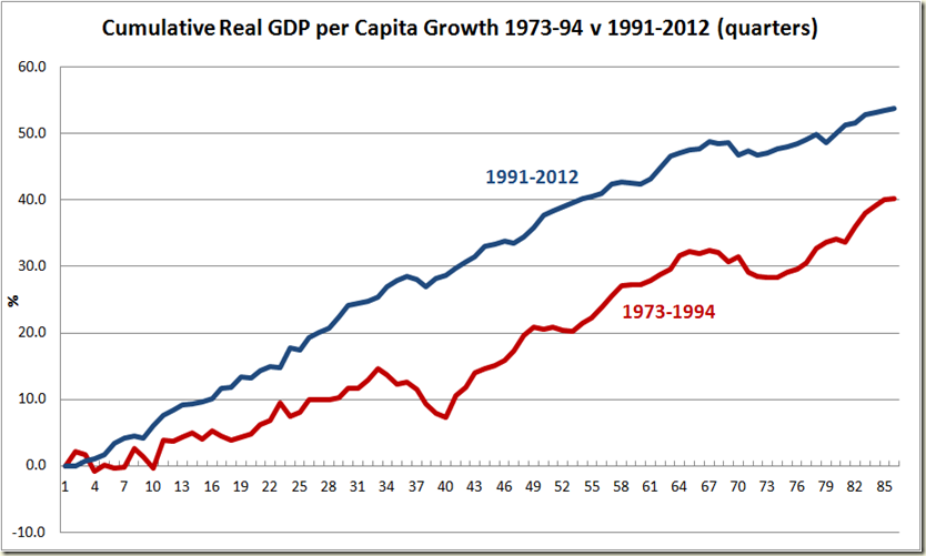
And just because I’m a graph junky, here’s the same graph but looking at GDP per capita. Unfortunately the ABS only goes back to 1973 for GDP per capita so I’ve got the cumulative growth from then till 1994 to ensure we have 86 quarters each:

image

The moderation isn’t as stark – we’ve had a few more bumps since 1`991 on the per capita measure than we have on the total GDP growth. But still. At least we missed those God awful downward hits that we had in the twenty years from 1973.

Thursday, March 14, 2013

Industrial Disputes: Unions forget they’re suppose to be on the warpath

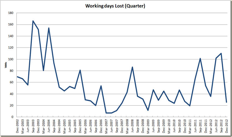
Well along with the good employment figures, the ABS also released the quarterly industrial disputes, and surprise, surprise, the amount of working days lost fell in the December quarter:

image

Look I know, I know. Who wants all that context, – show us up close, show us the past 10 years:

image

OK, look context is confusing. We all know that the December quarter is the low one for strikes, after all this time last year, The Australian noted when trying to explain why industrial disputes fell:

“But industrial disputation fluctuates seasonally, and generally falls in the final quarter of the year as workers go on annual leave.”

And given disputes have fallen in 12 out of the past 20 December quarters I guess “generally falls” means, falls just a bit more than it rises.

But hey, let’s not get bogged down in facts. Let’s assume December is the low quarter. Let’s see what the figures look like if we just look at the December quarter:

image

Yep, it is the second lowest number of disputes in a December quarter since the ABS has started counting.

Second lowest.

Damn militant unions.

OK, OK, I know what you’re saying, the key is to look at the annual numbers:

image

Again, too much context, let’s look at that past 10 years

image

Yep it did rise, and now it’s going down. And why did it rise? In the main due to disputes in the Education and training and Health Care systems. Due to disputes with state governments. In IR systems outside of the Fair Work Act.

But hey, we need to return the balance in IR and all that.

What about actual number of disputes, rather than the number f hours lost. Surely the new IR regime has led to strike nirvana?

image

Jeebus. You can see why businesses, The Oz and the AFR are worried.

OK, look, Quarterly figures hide things. Let’s look at the annual numbers of disputes:

image

So the Fair Work Act came in in July 2009. Gee, you can see the big jump after that.

Here’s breakdown according to industry, which shows that again, Education & Health etc is the main area:

image

On the per thousand employees measure however, the coal industry has been the worst hit:

image

And for the context of the coal industry disputes (the figures only go back to 2008 and many quarters there is nothing to count):

image

Sure there was an increase on this measure in 2011-12. Seems to have eased a fair bit.

Any way, I think we can file this one with the wages breakout and the low productivity that the Fair Work Act has wrought on this country.

But no doubt the usual suspect will find something. My guess – the annual figures (and compare it to the bottom of 2007) and the coal mining per thousand.

Employment soars in February, Unemployment steady at 5.4%

Holy wow. No one saw this coming.

The Labour force figures released to day by the ABS, showed that employment grew in February by a whopping 0.6% in seasonally adjusted terms.

Now I know 0.6% doesn’t sound like much, but  to put it in some context, as stats wunderkind,Shane Wright, from the West Australian, noted soon after they were released, it was the biggest increase in employment in the month of January February since 1995. (He must have a seriously good spread sheet system going!)

There have been only 13 months this century where employment growth has been over 0.5%. That’s 13 out of 157 months. So let’s say this is a pretty good result. Here’s what it looks like over the past 5 years:

image

And if 5 years isn’t enough context for you, here’s the past 10 years:

image

Yep – it’s the second best month of employment growth in the past decade. Not too shabby.

I guess Glenn Stevens was on to something when he said before the economics committee last month, “Overall, there is a good deal of interest rate stimulus in the pipeline.”

There is a bit of debate about whether or not this figure is “real” given the ABS has revised its sample, and certainly the big surge is a bit more than you would have expected, so I say, look, let’s calm down. This is just an estimate, and will likely be revised next month, so it might fall below 0.6%, but I think you’d have to be the worst possible grouch to be thinking these figures are bad.

OK, to the unemployment rate. So we had a massive boost in employment, but the unemployment rate has… stayed flat.

It sits at 5.4% in both seasonally adjusted and trend terms.

image

The close up of the 12 month figures is interesting. Is the “flatness” a plateau or the top of a summit?

image

So why did the unemployment rate remain steady? Because of the increase in participation. Is this a cruel joke on Wayne Swan, that he can get a big boost in employment but no joy in the actual unemployment figure? No. The reason participation increased is because employment increased. People were coming back to the workforce. Were the situation such that employment wasn’t increasing, it’s likely participation wouldn’t have either.

The participation rate increased 0.3 percentage points from 65.0% to 65.3%. In trend terms it remained steady:

image

What this figure does however suggest is that the calculation of the ABS – both in terms of numbers employed and those in the labour force – has caused this jump.  Again, this doesn’t mean the unemployment rate is false, but that perhaps the employment growth and the participation rate increase are a bit overstated. Next month might see things in a more sober light.

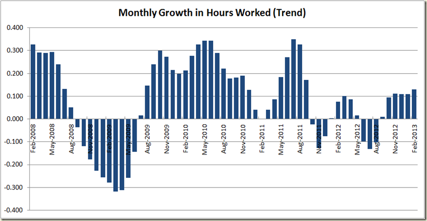
Now last months figures were revised as well, and whereas last month there was the estimation that the trend growth in hours worked had fallen, now we see a much different picture – an increase of .13% in February (and in seasonally adjusted terms a 0.7% increase in hours worked!)

image

The growth in hours is modest historically… and well that’s about all you can say about it. I’d like to get more excited, but I’ll go with suggesting this month that the trend really is your friend. 

The good thing about the figures as well is that both full-time and part-time employment increased. Here though, we see the seasonally adjusted figures a bit more calm than the overall numbers, and the trend rate still showing negative monthly growth – a good calming statistic for those thinking boom time is here again.

image

As a  result we see the unemployment rate of those looking for full-time work stabilizing with the overall rate, and both are down from the peak they were at 6 months ago:

image

The good news as well is that the employment growth has occurred for both men and women, but the growth in male employment does seem to have faltered a touch (but that’s really suggesting a bit more of the data than it is saying – it is pretty steady):

image

And we also see the unemployment rate stay steady for both

image

The number jump around again with the employment to population ratio – which remains flat at 61.6% in trend terms, but went up 0.3 percentage points in seasonally adjusted terms. Again, all good, but I’m sticking with the trend this month:

image

Now to the states, and here’s where we really see some weird things.

I‘m not a big fan of state seasonally adjusted numbers, because you see really bizarre things like the numbers we have for Tasmania:

image

The trend figures se Tasmania going from best to worst, and conversely, instead of QLD being the only state to decline , it becomes the biggest growing state!

image

So I’m calling a time out and saying, things look too weird for me. So let’s look at the annual figures to take a chill pill, and get some figures that make sense:

image

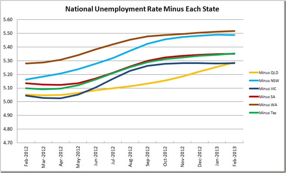
And now to the impact of each state on the national unemployment rate:

Queensland has improved from being far and away the worst state, to now tying with Victoria.

image

So in terms of drag on the unemployment rate, QLD and Victoria are both costing the nation about 0.1 percentage points on the national

image

So to recap. Big employment growth number in seasonally adjusted terms, but I think it’s safer to focus on the trend numbers, and also on the unemployment rate. Sure we had a big boost in employment, but the unemployment rate has remained steady, and I think that reflects how the economy is going quite accurately.

Wednesday, March 13, 2013

Drum Piece: Recessions ain’t all that technical

My Drum piece today got a bit econ nerdy and talked about whether or not Victoria is in a recession on the basis of 2 consecutive quarter (or perhaps even 3) of negative growth of State Final Demand.

My points is that you can’t say it, but neither should we discount SFD as some sort of meaningless stat. When SFD starts going down, it’s a good time to start peeking around a bit and seeing what else is going wrong in the economy.

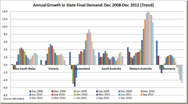
As a bit of a pointer, take this look at SFD of the states over the past 5 years:

image

I think it gives a pretty good representation of the GFC and the recoveries in all states.

Or maybe I just get distracted by all the pretty colours.

In the first draft of my article I was going to do a bit of a step back and look at the big picture of the national accounts. There wasn’t room, and also it was a bit tacked on, narrative-wise, so here are the graphs The Drum readers missed out on:

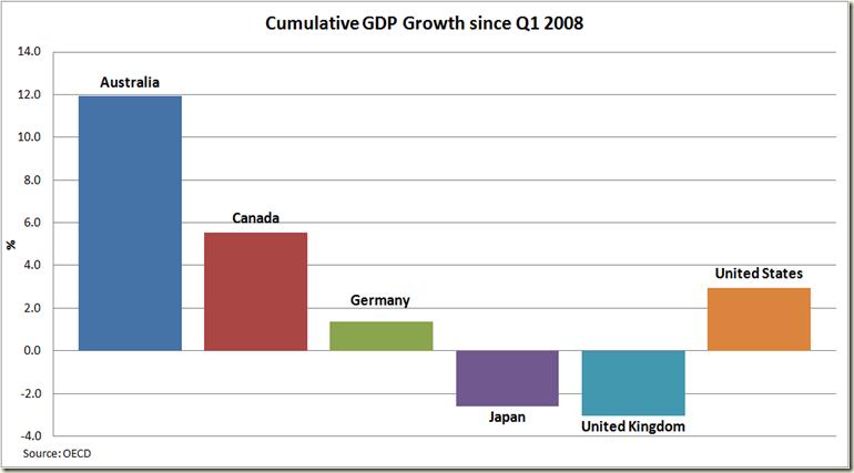
First the a comparison of how GDP has grown over the past 5 year compared to other nations. With the fourth quarter data of 2012 the past 5 years’ worth now contains only periods of the ALP Govt (but yes I acknowledge there is a fair bit of carry over in at least the first 6 months)

image

It’s pretty impressive, and amazingly shattering to anyone from the UK or Japan. Imagine living in an economy which is smaller than it was 5 years ago. And that’s in total. Forget about per capita.

Now let us compare that with how we went in the 5 years prior to Q1 2008:

image

Sure we’re leading but look us compared to everyone else. In 2003-2008 our growth was only 19% better than that achieved by the 2nd best country (UK). I. comparison, from 2008-2012, our growth was 115% better than the second best.

We have not only kept growing faster than these other countries, in the past 5 years we have increased our lead.

But I know what you’re thinking – the GFC is old news, how about since then? Well the ravages of the GFC began to ease in the second half of 2009. At that point even the UK and USA stopped having negative quarters of growth. So how have we gone in comparison to those countries during the “recovery” stage?

Well as the table below shows, the GFC pretty much stopped “directly” in the 2nd quarter of 2009.

  Q1-2008 Q2-2008 Q3-2008 Q4-2008 Q1-2009 Q2-2009 Q3-2009
Australia   0.3 0.7 -0.7 0.9 0.0 0.7
Canada   0.5 0.7 -1.1 -2.2 -0.9 0.4
Germany   -0.4 -0.4 -2.0 -4.1 0.2 0.8
Japan   -1.2 -1.1 -3.2 -4.0 1.7 0.0
United Kingdom   -0.9 -1.8 -2.1 -1.5 -0.2 0.4
United States   0.3 -0.9 -2.3 -1.3 -0.1 0.4
OECD - Total   -0.1 -0.7 -2.2 -2.3 0.2 0.6

After that the run of periods of negative growth stopped (for a while). So let;s see how each of those countries has done since Q3 2009:

image

What do you know, we’re still leading. Yes everyone is growing better than they are when you don’t include the GFC, but that really highlights just how vital it is to avoid the depths of the recessions. Growth coming out of them well be pretty similar for all – we’re not miles ahead of Canada for eg, but you can’t look at the past 5 years and pretend the GFC was just some blip that had no impact.

But I know what you’re thinking – sure anything looks good if you spread it over a few years, but what have you done for me lately?

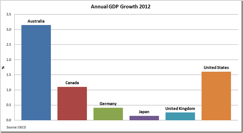
Well here’s how all of those countries did in 2012:

image

Any way you slice it, our economy is not just outperforming the big economies of the west, it has been doing so for 5 years. You can thank China if you want, or the Government, or if you’re desperate you can say the past 5 years are all due to John Howard, but you cannot say we’re underperforming. Given how badly the USA and Japan have been (which together account for about 20% of our exports) it’s rather stunning how well we have done.

And for an added treat, just to make any Australians reading feel extra warm and fuzzy. Here’s the cumulative growth over the past 10 years:

image

Or to show just how stark the GFC was, here’s the graph in linear form showing the cumulative growth each year since 2003:

image

Someone was doing something right around 2008-09. But I guess we should bitch and moan about how the Govt blew the surplus…

Thursday, March 7, 2013

GDP–Australia’s economy grows by 3.1% in 2012, but looks to be slowing

I was going to do this last night, but I was side-tracked doing some other work, and also by the laughs going on down in Victoria.

So here is yesterday’s post today:

***

And so today the December 2012 National Accounts came out showing a nice (and reasonably in line with expectations) result of real GDP annual growth of 3.1% in seasonally adjusted terms. It came off the back of growth in the December quarter of 0.6%.

In trend terms the December quarter growth was 0.6%, but the annual figure was a touch lower than the seasonally adjusted figure, coming in at 2.9%

It’s always worth remembering that the figures are statistical measures, subject to confidence levels and adjustments as are all other such economic data.

If we look at how growth figures have been revised over the past few quarter we see a bit of variation:

  March 2012 Figures June 2012 Figures September 2012 Figures December 2012 Figures
Growth: Sept 2011

.97%

1.13%

1.18%

1.18%

Growth: Dec 2011

.62%

.50%

.70%

.59%

Growth: Mar 2012

1.30%

1.38%

1.30%

1.22%

Growth: June 2012

.64%

.58%

.65%

Growth: Sept 2012

.47%

.65%

Back when the March 2012 figures were released showing 1.3% growth in that quarter, there was a fair bit of scepticism.  It was subsequently revised up to 1.38% in the June 2012 figures, then back to 1.3% in the September 2012 figures, and in the latest figures it is at 1.22%. Similarly the June 2012 quarter figures has been revised up then down.

This month there has been a pretty sizeable revision of the September 2012 figure – from 0.47% to 0.65%. However this hasn’t changed the year of year growth estimation of the September 2012 data because as we can see today the December 2012 and March 2012 figures were both revised down.

So in the September 2012 data annual growth was going at 3.1%, and the most recent figures still have the September 2011 to September 2012 growth at 3.1%.

So it’s probably not too sensible to to get too caught up in revisions of any one particular quarter, but if you want to argue the economy was doing better than people thought in the September quarter of last year, today’s figures give you cause to at least begin arguing that.

Anyhoo let’s look at some graphs.

First the quarterly growth:

As you can see 4 of the past 5 quarters have had growth below the 10 year average.

image

Not surprisingly this has meant that annual growth is now only just above the 10 year average. It’s still doing well – 3.1% is nothing to sneeze at – but the trend estimate really highlights the sense that the economy slowed down in the second half of last year. Also once the March 2012 quarter is left out of the annual growth figures (ie in the next lot of figures) then it’s likely we’ll see a drop. 

image

To keep around 3% annual growth the March 2013 figures will need to see growth of around 1.1%. I can’t see that happening – not unless the GDP deflator really goes down.

Which brings us to the next point  that while this is okish news, it’s not as good as it normally would be for the Treasurer and his desires for growth to lead to increased tax revenue.

Once again we had a situation where nominal GDP growth (ie growth in current dollars) was below real GDP growth (growth in volume terms – ie accounting for inflation).  Once again the GDP deflator was in the negative – the first time going back to 1959 (and I’d bet, well before that) that there have been 3 consecutive quarters of negative annual growth in the GDP deflator:

image

So forget inflation, in GDP terms were in deflation territory – and in a way that we have never encountered before (at least outside of the Great Depression). To get a grasp of how different things are now to what was occurring during the mining boom of the early-mid 2000s, compare the real GDP annual growth with the nominal growth:

image

As shown earlier, we are currently pretty much on the 10 year average of real GDP growth, but the 10 year average of nominal GDP growth is 6.7%, whereas at the moment we are bumping along at 2%.

Just imagine how fatter Wayne Swan’s tax revenue would be if he had 6.7% nominal GDP growth? He could lay in a hammock and watch the surplus come in. Alas the hammock days of being a treasurer are over for now.

He can’t even look to great joy from export prices, because the terms of trade fell again. Down 2.7% to 88.8:

image

It still looks nice and high compared to the late 1990s, but a close up of the past 5 years shows a fairly different picture:

image

Not really booming is it?

Now to everyone’s favourite measure – productivity.

It grew in the December quarter by 0.5% in trend terms and 0.7% in seasonally adjusted, making it 8 consecutive quarters of trend productivity growth, which is the first time that’s happened for 10 years.

image

In annual terms we’re at a healthy 3.5% seasonally adjusted and 2.9% in trend.

image

Next quarter will likely see drop in the seasonally adjusted annual growth because the March 2012 saw 1.9% growth in that quarter, so unless the next quarter matches that (unlikely) it will drop a bit, but it will remain positive.

We have also had now 4 consecutive quarters of productivity growth above the Dec 1997-Dec2007 average.  Surely cause for a bit of cheer. (Though I’m not sure why I’m telling you this because no doubt it was front page of The Oz and AFR)

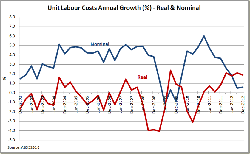
On labour costs, “Real unit (non-farm) labour costs” did rise again in the seasonally adjusted measure, but it declined in trend terms.

There is always a bit of hoo-hah about labour costs rising – as though they can always keep falling forever. But as I’ve noted before, the GFC caused labour costs to dive, and the recent rises are now pretty much in line with the trend of where cost were expected to be given the trend of the 5 years prior to the GFC hitting:

image

When it comes to the RBA worrying about labour costs rising, it looks at the nominal rate, and here we see nominal growth is actually below real growth – because of the GDP deflator being negative.

So are we going to see the RBA complain about rising labour costs leading to inflation? Not any time soon. With annual nominal unit labour costs growing at 0.6%, the whole “wages breakout” myth takes another big hit. In fact critics of the Fair Work Act are now at the point where they pretty much have to abandon macroeconomic data and focus on either industry specific (which too be honest hasn’t helped them much) or the dodgy “anecdotes”. Given that has been their main source of “data” it at least won’t mean they have to change much of their research.
image

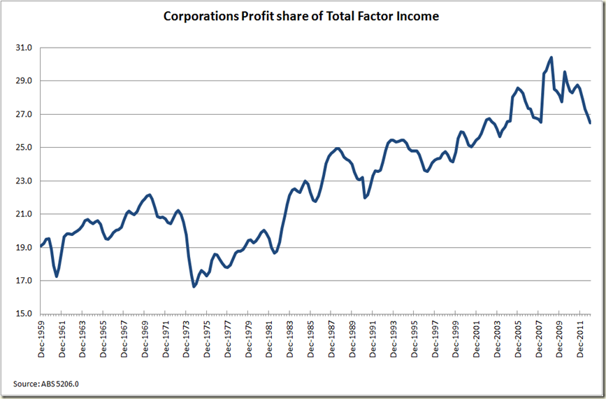
In the breakdown of where the money is going, the compensation to employees of total factor income rose slightly, meaning we have well and truly put the GFC hit to employees behind us, and the share is now back at long term (well at least past 20 year) levels:

image

The share going to private corporations profits has thus declined again and is now showing a fairly big turnaround to a 40 year trend:
image

OK now to the states. There’s been a fair bit of palaver about Victoria now being in “recession” because it has shown 2 consecutive quarters of negative growth in State Final Demand:

image

Now firstly (and as has been stated a little bit on Twitter by a few econ types), State Final Demand is not equal to Gross State Product. For example a lot of what Western Australia is “demanding” might actually be coming from Victoria. In such a circumstance it wouldn’t show up in Victoria’s SFD, but in WA’s even though it was being produced in Victoria.

Secondly we shouldn't give too much of a crap about whether or not a state or a nation is in technical recession because measures like 2 consecutive quarters of negative GDP growth are just a bullshit arbitrary designations of no real worth that no one really cares about if they want to be taken seriously outside of a talk-back radio show.

You want to know if you’re in a recession? How about looking at employment growth – that’s as good an indicator as GDP growth for the health of an economy.

But be that as it may. Clearly Victoria’s economy is not healthy; neither is South Australia's, and well Tasmania…  .

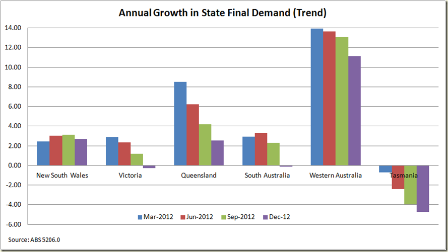
Quarterly SFD is also in my opinion a bit jumpy so I prefer looking at annual growth:
image

Again, Victoria not doing well. Recession? I’ll leave that up to those needing to sell newspapers.

Similarly Queensland is not coping with life as good as one might hope – and that is a bit more significant because you would expect its industries to be demanding production from other places. That it is not analogous to Gross State Product doesn’t mean it is not a good indicator of economic health. Just look at QLD’s annual SFD growth back to 1985 and you get a pretty good picture of when the state was doing well, and when it was not:

image

All in all the National Accounts tell us what we all knew – the economy is grew at trend through 2012, but 2012-13 looks to be slowing, but not in any horrific sense, – probably around 2.4%-2.6%.
Below trend but now worse than that, but certainly no better. Inflation next to nothing, and the budget certainly not going to be in surplus (not that there’s anything wrong with that).