Today the June Quarter CPI figures came out showing that inflation had increased by 0.4% in that quarter and by 2.4% in the past year. In seasonally adjusted terms the figures are 0.5% and 2.3% respectively.
Before we get to the nitty gritty, lets look at the long term:
Clearly the back of inflation has been broken, to borrow Keating’s term. But just because 10% inflation is a thing of the past, doesn’t mean it’s of no concern. But let’s look at the past 10 years.
It is pretty much right in the middle of the sweet spot. But looks are a bit deceiving. As you can see, the past 4 quarters have been rather a bit higher than the previous couple.The reason for the slight jump up in prices in the September 2012 quarter, is of course, the carbon price.
The impact of the carbon price is pretty obvious when we look at the quarterly changes:
What is also noticeable is that the three quarters since the carbon price has come in have been quite low. And as this is the last quarter which will include the September 2012 figures in the annual amount, next month should see a pretty big drop.
A good idea of what we’re going to see, can be shown if we look at the 9 monthly change in inflation, as the latest amount does not include the Sept 2012 figures:
A drop from 2% to 1%. For the next CPI figure to have inflation running at over 2% it would need the September quarter to rise by around 0.9%-1.0%. Now that certainly could happen, but I wouldn’t bet on it.
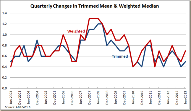
OK what about the “underlying inflation”. How did it all go on the RBA’s measures of Trimmed Mean and Weighted Median?
Well the Trimmed Mean clocked in at 0.5% and the weighted median at 0.7%
If we look at the annual rises, the weighted median (which as a rule is the higher figure) sits at 2.6% and the trimmed mean at an oh so low 2.2%.
So going by these figures alone, you would not think the RBA would be worrying about cutting rates. But the figures were slightly above what the market was expecting and sot he Aussie Dollar took off. Soon after however the latest China PMI data came out with a score of 47.7 that was well below what the market was expecting, and so woosh down went the dollar.
The market is now pricing in a 62% chance of the RBA cutting rates. A little bit down on where it was two days ago. But in the past couple hors, the dollar has dropped another half a cent, so I would suggest the expectation of a rate cut is growing.
In my Guardian post yesterday I noted the importance of the tradeables and non-tradeables.
Today we saw the quarterly growth for tradeable commodities increase by 0.3% and non-tradeables go up by 0.5%.
In annual terms it comes in at minus 0.7% for those goods where the price is largely determined overseas, and 4.3% for the non-tradeable ones:
In the next quarter the fall of the dollar will truly start to flow through, so we will likely see the influence of tradeable goods and services having a positive impact on the CPI. But as the non-tradeable level also includes that impact fo the carbon price (non-tradeables rose by 1.8% in the September quarter, it might balance out). We shall see.
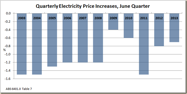
Speaking of carbon pricing, the June quarter saw the price of electricity fall:
Now this is no shock. Electricity prices always fall in the June quarter because its the quarter during which people stop using air conditioners.
But the fall in the past 3 months was the third smallest drop in the past 10 June quarters:
It all flows through to an annual increase of 17.2%
But again, as is pretty obvious, the annual rate in the past 4 quarters have all been affected by the introduction of the carbon price. If we look again at the past 9 months we see a pretty stark picture emerges – a rise smaller than occurred in the 9 months to June 2012, June 2011 and June 2010, and all other Junes back to June 2007.:
The main contributors to the overall CPI was men’s and children’s clothing, tobacco and medical and health expenses.
Housing was also a contributor, so let’s look at housing prices (owner occupied), because the RBA will definitely be taking a close look
Quite a nice little rise. The interest rate cuts certainly seem to be flowing through.
I had a bit of a look at Canberra, because given the cuts to the APS and also the rumoured cuts should the LNP win, I wondered if the prices were falling (note this includes rents).
It seems not, and certainly not like what happened after the 1996 election. It seems
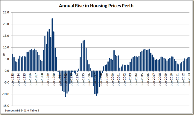
I wondered about Perth as well, to see if signs of the mining boom ending were happening there:
Not so much in the housing sector.
So will the RBA cut rates? I don’t these figures will force them one way or the other. I don’t think there’s much worry about rising inflation, so if anything these figures don’t put a halt on any plan to cut them. I still think they are a chance to see what happens in September once the flow through of the drop in the dollar occurs. Especially when you look at the automotive fuel price changes, which showed a decline in prices in the past 12 months. But it is obvious to anyone who owns a car, that the fall of the dollar in May and June has had an impact of petrol prices, so expect to see this jump next quarter:


