The Monthly labour force figures came out today and they do little to suggest the Treasury's prediction of 6.25% by June next year will be wildly inaccurate.
In seasonally adjusted terms the unemployment rate in October stayed flat at 5.7%. Although given September’s rate was 5.6755% and October’s was 5.7442%, it was all down to rounding that kept the rate flat when in fact it increased 0.068 percentage points.
In trend terms, the rate rose form 5.7% to 5.8%. But here again rounding is at work. The trend rate in September was 5.74% and in October it was estimated to be 5.75%. So as a result of rounding it increases up from 5.7% to 5.8%, but in reality it only increased by 0.0106 percentage points.
So the seasonally adjusted version shifted by more than the trend measure but the trend rate “increased” while the seasonally adjusted rate stayed “flat”.
Don’t you just love economic statistics?
At this point we should remember these are estimations. The seasonally adjusted rate for example sees the ABS being 95% confident that the rate shifted somewhere between in falling 0.3 points and rising 0.5 points.
But that statistical rhubarb aside, let’s get to the graphs:
First the 10 year picture finds us back where we were 10 years ago. Now back then being below 6% was seen as an economic wonder. Now if it were to stay at 5.8% there would be grumbles about a weak economy (and reasonably fair enough).

The close-up 18 months picture has us aching to see a plateau. It does however highlight that we haven’t quite got the the 5.8% mark yet, and for use to get to 6.25% would require a speeding up of unemployment as was seen after the brief semi-plateau observed at the end of 2012:

But the story today wasn’t so much about unemployment as employment. The number of jobs in trend terms fell 0.036%

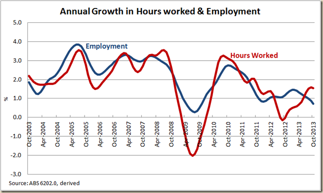
And it makes for a pretty ugly annual growth figure. Employment growth is heading back to the level we saw during the GFC. Who knew it took more than just saying “Australia is open for business” to get people hiring workers?

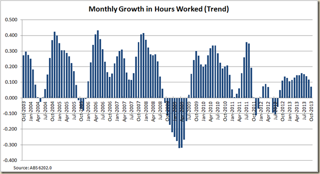
Although intriguingly the hours worked in the month increased:

But it appears to have peaked in annual growth terms:

And when we compared growth in hours worked with growth in employment it seems that perhaps this peak of growth in hours means the disconnect between the two measures that has occurred since mid-2012 is about to end

It also means for the first time in 6 months the monthly hours worked per worker did not increase in October

But while the story of the labour force figures was the lack of job growth the really interesting part of that story is the breakdown of full-time and part time employment growth:
Trend part time jobs in October grew (just) while full-time work fell for the 6 month in a row.
And this meant that for the second month in a row there are now fewer full-time jobs than there was 12 months ago:

The drop in full-time work has hit men the hardest:

But lets compare the FT/PT growth by gender:

For men the growth in part-time work is quite dramatic, for women it’s pretty standard:

Not surprisingly the lack of full-time work for men has kept the gap between the unemployment rate of those looking for full-time work and the overall figure at pretty ugly highs.

What is also concerning is that while yes you can blame some of the fall in participation on the ageing workforce, the percentage of 15-64yo in employment continues to fall (though again some of this can be attributed to the decline in youth employment due to them staying at school longer now. I really wish the ABS did a monthly 25-54yo breakdown to get “prime working age” figures – and yes I can work it out using the “detailed” figures that will come out next week, but geez, that requires work!)

For me though an interestingly little nugget I discovered is that for the first time in 30 years the proportion of women employed (15-64yo) is less than it was 5 years earlier:

After the surge of women into the workforce in the 1980s and the continual strong growth during the late 1990s and first part of this century the growth it has fallen rather dramatically. For an economy that has thrived on the increase in participation of women this might be the big issue – ie not just ageing, but have we reached the peak level of women workers? Is two-thirds of adult women working the highest we can get?
My guess is that while more women-friendly work places and the breaking down of discrimination has led to the increase in women working – mostly in part-time work. For the number to go any higher would require, I think, some fairly major changes of culture in terms of which parent stays at home.
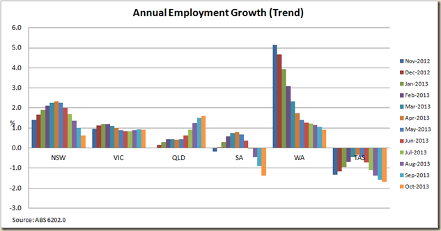
Finally a quick look at the states. And break out the champagne you austerity champions, QLD has had the strongest employment growth of the past 12 months:

A look however at the past year suggests its position is due to a nice pick up in QLD and a big fall in WA and NSW. But at least QLD’s unemployment rate remains steady at 5.9%. Good news:
