My Drum piece today is on the GST and on tax in general. The headline given is “why the GST may not be good for us”, which I don’t quite agree with us. I am actually in favour of the GST and have been since 1992 when I wrote a 3rd year Politics Essay on “Does Australia Need a New Broad-Based Consumption Tax as Advocated by the Liberal Party in its Fightback! Program?” (true story – I didn’t get a great mark – and upon re-reading it I’m surprised I passed at all given how badly it is written)
The question is if we do broaden the tax – which again I think has many good points to it, we can’t ignore the regressive nature of the tax. The problem is we currently have the best redistributive tax and transfer system in the world in terms of spending on welfare leading to improvements in equality. Broadening the GST might be great for efficient revenue gathering, but it won;t be great for efficiently redistributing welfare.
Anyhoo. Here are the graphs:
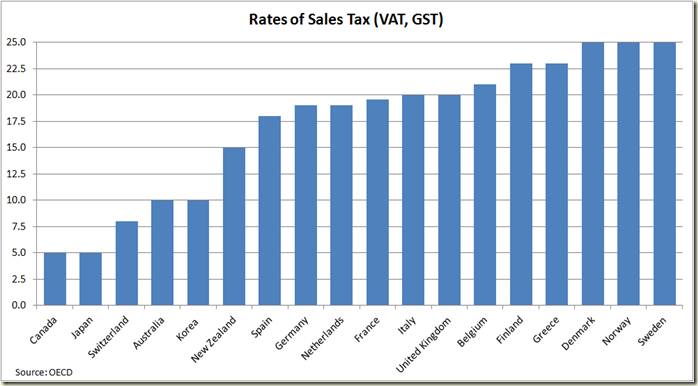
Our GST is pretty low by OECD standards (the USA of course doesn’t have one because its sales taxes are mostly State based)
Matt Cowgill, ACTU policy wonk and part-time blogger had posted some graphs on Twitter a while back that I recalled when I was writing my piece. He kindly sent me his spread sheets for me to play around with. I highly recommend you read his blog, and you should all go to his blog and leave comments – something like “Wow it’s been ages since you last wrote a post” and “I thought you said you were going to post every week this year?”
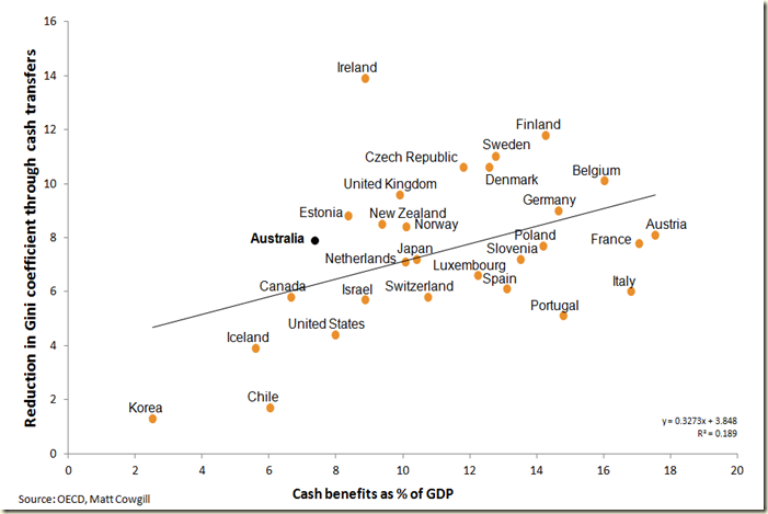
Here’s his scatter graph showing the level of welfare expenditure and reductions in inequality:
A good way to look at the graph is to view those above the trend line as getting above average redistributive returns for their welfare bucks. You can also see for example that France and Australia reduce their inequality by about the same amount as Australia does but they spend around 18% of their GDP to do so – we spend less than 8%. The reality is that while introducing a GST might lead to more welfare being spent it is unlikely to lead to significant improvements in our equality – and certainly not in a marginal sense – ie in a improvement in equality per extra dollar spent in welfare.
As you can see below, we do it better than any other nation except Ireland (and by the way anyone who has theories as to why Ireland is so much better than others, let me know. I have no idea)
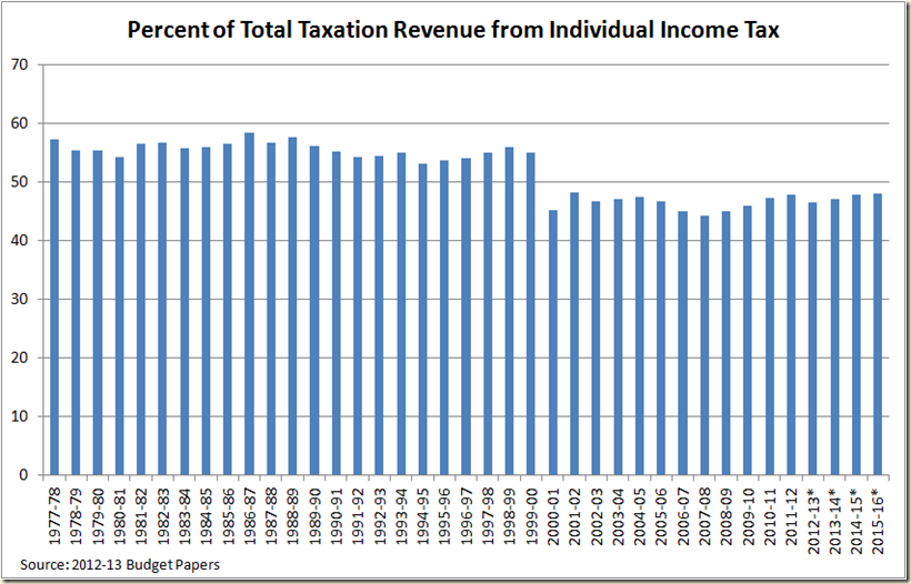
The reason this is an issue is the tax base is shrinking. As you can see from the next graph, post GST the share of tax revenue from income tax shrunk:
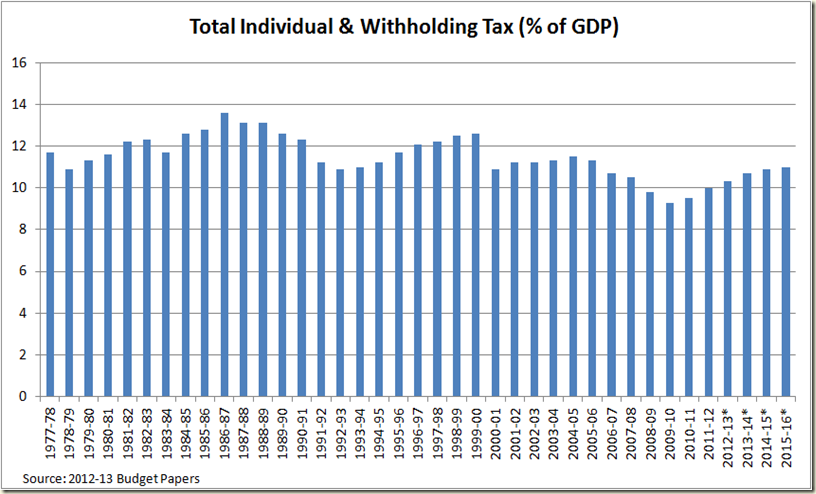
Personal income tax revenue has also shrunk in real terms – and reach a nadir in the GFC – a mere 9.3% of GDP in 2009-10. By contrast in the year before the GST came in, it was worth 12.6% of GDP.
Company Tax was slaughtered during the GFC:
Perhaps Peter Costello might have found a way to get to a surplus if his company tax revenue was 1% of GDP lower than it was during the boom, but I doubt it. Also note the projections for post 2012-13 still don’t get up to the mining-boom revenue levels and they include the new MRRT.
And sales tax? Same story:
It boomed during the early 2000s but since 2004-05 has declined as consumption has moved towards GST-exempt items.
So clearly the tax take needs examining. But when we leap into the GST bucket, we need to realise this:
Sure those private school fees mean the wealthier pay more than the poor, but look at food. My calculations are that the current GST-exempt food accounts for around 11% of total expenditure of those in the lowest income percentile. And bear in mind that 11% is pretty much unable to change – it’s a necessary expense.
So let’s increase the GST, but then do we want to be like France which has a consumption tax of 19.6%, and yet is having to spend 18% of its GDP to get the same equality outcomes that we do currently for 7.4% of GDP?
Tax policy ain’t easy. And it’s perhaps just one more reason why the GST should have been allowed to be considered in the Henry Tax Revue.
****
I have realised I haven’t posted many of my recent graphs from my Drum pieces. So here’s a quick graph dump from last week’s piece on QE3 and nominal GDP growth:
It’s quite striking just how rare a thing it is for annual nominal GDP to decline.
It happened here in the GFC as well, and after a nice jump is again on the decline, even as “real GDP” increases growth.
My piece from Two weeks ago was on the Aussie dollar and Mining and had a few graphs as well (I know, the shock). I won’t post them all but the ones I liked looked at the divergence of our currency with our terms of trade:
Going back even further we see this:
So yep, I think either the dollar needs to come down or prices need to go back up, otherwise we’re in for some hard times.
Again just looking at base metal prices we see the dollar is massively over valued:
ANd my favourite graph of that post was showing the Index of Base metal price in $US and $AUS terms:
That gap is unprecedented.
And lowering interest rates may not help:
