And so to the state situation on the labour force data.
There’s a fair myriad of stuff you can look at – full-time v part-time, men v women. In the past I have examined some of these with respect to one state – eg WA or QLD, but today I was more in a mood just too look at the total employment picture.
So here’s the May employment growth in seasonally adjusted terms:
Yes, Tasmania the big winner, which tells you all you need to know about the worth of seasonally adjusted monthly growth data on a state by state basis. This will be the last time I bother with it. It is next to useless.
So what it is the trend scenario?
Not good for WA – it reinforces the negative view of the state’s economy in recent months. QLD is back in the negative after a couple months of uptick.
So how has everyone been doing for the whole year?
NSW is the boomer state, and would you know it, but SA has had bigger employment growth than WA.
Now lets have a look at state annual employment growth going back to 2000. And for comparison I’ll include the national growth rate, and I’ll also keep all the state on the same scale, to give a good picture of which states really boomed this century.
First the big mining state, WA:
It experience massive growth from 2005-06 and in the past two year, compared to the rest of the country has been growing very fast. Now however it is experiencing employment growth right on the national average.
QLD is the other main mining state, how has it gone this century?
As you can see – it was struggling in 2001 – September 11 and Ansett’s collapse didn’t do wonders for tourism. I recall living in Cairns at the time and things were pretty grim. The mining boom helped it no end. But since the GFC it has struggled to grow above the national average, and currently it is well off the pace.
So if NSW is the big growth state at the moment what is it’s picture like?
And here we see the two-speed economy. During the mining boom, NSW was consistently below the national average. You can however see the impact of NSW on the national average due to its size, as rarely does it grow out of sync with the national rate. Interestingly though, this has actually occurred in the past year.
And the other non0mining state, Victoria?
It is a pretty close representation of the entire country. It has however of late drifted below the national average. And with a stack of bad news re jobs losses in Geelong coming out recently, this doesn't look like changing soon.
And South Australia? Old rusty, how are you doing?
It didn’t have a good time of it during the mining boom year. What is worth noting is that the employment situation in 2012 was worse in SA than it was during the GFC. That’s not good.
But if you want not good, you need to head across the Bass Strait:
Tasmania actually had a fairly decent time of it from 2003-06. And it bounced out of a yucky 2007 with aplomb. But it was slaughtered during the GFC, and it hasn’t recovered. Just a sad sight.
Now I don’t normally do the territories mostly because they’re so small, but ACT now only has about 20,000 fewer workers than Tasmania, so I might as well include them.
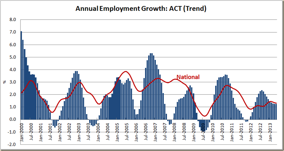
First ACT – the very definition of boom and bust:
It’s good, it’s bad, it’s good, it’s bad. And the growth is around the same relative to the national rate since November 2007 as it was during the Howard years.
And finally NT:
Northern Territory is the only state/territory during this period that has had over 7% annual employment growth. It actually got through the GFC quite well, but suffered some bad aftershocks.
Which brings us to the unemployment rates of each state.
Tasmania has the worst at 7.3%, then SA with 5.9%, QLD with 5.7%, Victoria on 5.5%, NSW on 5.5% and WA breaks through the 5% barrier to 5.1%:
And now to look at what the national unemployment rate would be if we didn’t have to count each state:
WA remains still the biggest boost to the unemployment rate, but it;s boost of 0.06 percentage points needs to be viewed in the context that a year ago it’s boost was 0.18 percentage points.
Less and less are the national figures being able to rely on the WA to help make the picture look good.


1 comment:
Every time I see those graphs, I can't help but notice how it was the resource states that most dragged us down in 2009-10, and VIC and NSW that lead the way out. everyone but the miners tried their hardest to keep staff on.
Someone should point that out next time Barnett argues about shares in the GST.
Post a Comment