And so today we get the unemployment rate figures. My Post over on The Guardian has a bit of a look into the figures, so I’ll leave some of the things over there (go over and leave a comment will you?!). But here’s my run down of my usual lot of graphs.
The seasonally adjusted rate came in at 5.7%, so too did the trend rate.
When we look at the 10 year graph, the long slope up since the end of 2010 is pretty clear:
Even worse when we go in for the 12 month close up we see that there’s not a hell of a lot of plateau going on:
How about actual jobs’ growth? Well in June there were 10,300 extra jobs in seasonally adjusted terms – good enough for 0.1% growth. But let’s not kid ourselves, that’s not real flash:
Looking at the annual rate of jobs growth we really get the context of where we’re at – middling at best:
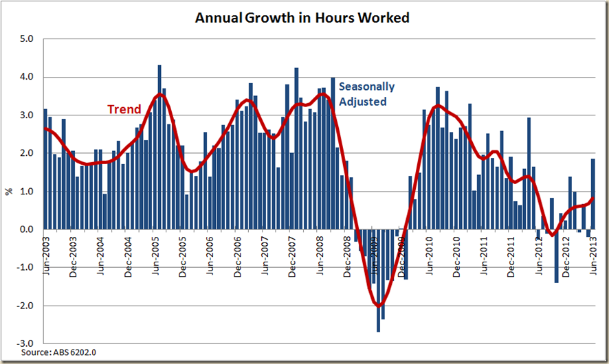
And when we translate this in to hours work we see that there was a bit of a increase i hours work in monthly growth terms, that even kept the trend rate positive:
And this even showed up in the annual growth picture, With the trend heading up at least. Incidentally the growth in hours world for the June quarter was around 0.5%, so it will be interesting to see how GDP grows in that quarter and the resultant GDP per hour worked figure.
Despite the increase in hours, the big pick up with in part-time work, not full time. And as you can see from the next chart looking at annual growth in both full-time and part-time work, this year, part-time has been the go:
And if you look at full-time Employment Growth over time we see it’s a slightly worse picture than the total one. It’s not dire, but it’s not really you’d write home to Mum about, if you were away from home and for some reason you thought writing to your Mum about the latest labour force data is what she wanted to know…
My new favourite metric of comparing the full-time unemployment rate to the total unemployment rate (I do this over on my Guardian post) show a widening gap. Not good:
OK, to the more boring figure of the participation rate. It actually went up! Break out the champers!
What about our old favourite, the employment to population ratio? Steady in trend terms, but the trend of the trend (as it were) is not good. Also not good is that the 15-64 rate is not going up either.
And let us end with a look at whether men or women are doing better. – Men just:


2 comments:
You're obviously not a proper journalist, Greg. What does "came in at" mean regarding the unemployment rate. The correct verb is jumped,. In a pinch, you can use leaped but please don't use "came in at".
It makes it sound like there isn't a major emergency in employment.
Hi Greg.
I don't see how the participation going up is necessarily a good thing. It is compulsory for everyone who is on Newstart to participate in some kind of Job seeking or skill improving activity. The participation rate going up could simply mean that more people are actively looking for work, therefore unemployed or underemployed.
Post a Comment