Tuesday, April 24, 2012

Inflation Rate: CPI 1.6 per cent (and the Phillips Curve)

The ABS released the first quarter inflation figures. The CPI annual figure is now down to 1.6%. That is seriously low. Actually it is a bit unrealistically low as the falls are due to massive drops in fruit and vegetables which had increased artificially because of floods and cyclones, to whit the seasonally adjusted CPI for the quarter is actually negative: 
-0.2%.

So as everyone else does let’s look at the RBA’s weighted and trimmed means which flatten out all the big swings.

Both the weighted and trimmed means increased by more than did the CPI in the past quarter: 0.4% for the weighted, and 0.3% for the Trimmed.

The annualized rate is what it would be if the last quarter was replicated over the next three questers, the annual rate is what has happened for the past year. SO the annualized rate is good at projecting what would happen if nothing changed, the ‘annual rate” is good for smoothing out bumps.

image

Since September 2008 inflation has been steadily falling. To get a sense of just how amazing this situation is lets have a look back over the past 35 years:

image

I find it quite hard to believe that someone who turns 21 this year has basically never known life with inflation above 4 per cent. It also shows just how well the RBA has done to keep inflation within the 2-3 per cent band.

I think the RBA could have dropped interest rates this month, but whenever you seek to criticise the RBA, you really need to have a look at this chart and realise they’ve done a pretty damn good job.  Incidentally the spike in late 2007-early 2008 shows Wayne Swan was right when he was saying the inflation genie was out of the bottle. I shudder to think where rates would have gone had the GFC not slapped the begeezus out of inflation.

The rate is now right down the bottom of the 2-3% band – so the extremely easy money is to bet that the RBA will drop rates in May. But will they drop them by 50 basis points? I would, mostly because the banks have been increasing rates since the RBA last moved in December, so a 25 basis point drop would not have as much impact as it normally would had banks not already increased their rates. Also I’m not a believer in dropping rates 25 point one month and another 25 points the following. Do it 50 in one go.

Interestingly here’s a chart of the cash rate above inflation over the past 20 years:

image

The cash rate is now just 2.05 percentage points higher than the annual inflation rate – at level below the 20 year average difference of 2.74 percentage points. So you would only think the RBA would drop rates if it feels that it needs to to help growth. I think they do think that.

***

The rest of the post is a bit “wonkish” So if you are not all that fond of economic theory type stuff, no need to read on

A couple weeks back Paul Krugmann was looking at the old Phillips Curve which compares inflation with unemployment – the theory (and it is rather contested) is that as unemployment increases, inflation decreases. Krugmann noted that the 1970s – during which inflation increased as unemployment increased – didn’t “destroy the Phillips curve” but:

What it did was show that unemployment wasn’t the only determinant of current inflation; expected future inflation is also crucial.

And what the Phillips curve with expected inflation implied was “clockwise spirals” in unemployment-inflation space. Suppose you came into a recession with, say, 10 per cent inflation. This inflation rate would fall in the face of high unemployment — and expected inflation would eventually fall too, so that when unemployment fell again inflation would remain lower than it was pre-recession (until the next boom).

A look at what happened in the 1990s here shows that is almost exactly what happened:

image

We started at the top left with inflation 6.5% as unemployment increased we slid down the Phillips Curve to a point of inflation at around 2% and unemployment at 11%. We then see the expectations of inflation lowered and the beginnings of a clockwise movement with inflation going up a little bit as unemployment declines.

What was interesting however is that during the 2000s for most of the time the Phillips Curve relationship didn’t really happen:

image

For much of the 2000s, inflation (as we saw in the first graph) stayed low and unemployment declined (the starting point on this graph is the bottom-right when unemployment was around 7 per cent). You can credit the RBA or you can credit John Howard and Peter Costello, but you can’t credit the Liberal Party’s IR shift, because the the period when inflation started going back up was after Work Choice had come in. So by the time the ALP was elected in 2007 unemployment had hit a wall and inflation was going up – and going up dramatically (cue much talk about the non-accelerating inflation rate of unemployment – or NAIRU)

Then the GFC happened and now let’s see what has happened on the Phillips Curve:

image

We start our journey at the top left with unemployment at 4.2% and inflation at around 4.7%. When the GFC hit we again slid down the Phillips Curve just like in the 1990s. And from when unemployment peaked at 5.8% the clockwise motion began again. Except in the past few quarters it seems to have got stuck – with unemployment staying around 5.1-5.2%. The question is will unemployment fall and inflation stay mostly flat as happened in the 2000s?

Clearly if the RBA does drop rates that will hopefully lead to a drop in the unemployment rate as more firms invest, people buy homes etc etc. If that occurs it is likely inflation may increase, but given the budget is going back into surplus there won;t be much supply side pressure coming from the Government (especially as everyone agree the private sector is still a bit punch-drunk after the GFC). Wayne Swan and Julie Gillard are hopping for the Phillips Curve to stay horizontal and the unemployment rate to drop . 

The answer to what may happen could be to look at what has happened since 2005 when the unemployment rate was roughly the same as now at 5.1% and inflation was a touch higher at 2.6%:

image

Yep one big circle.

Ain’t economics fun.

Thursday, April 19, 2012

Tony Abbott, Paid Parental Leave and the Productivity Commission

In the past month Tony Abbott has been very big on the glories and wonders of the Productivity Commission. He wants them to look at whether the Government should subsidise nannies. Such a suggestion is not of course a “policy” because it binds him to nothing, but it nicely gets out the impression he might do something. He also makes sure that it’s only in the fine print that he says he won’t increase overall funding, which of course means if people can get nannies subsidises, some child care that is currently available will be either removed or cut. Mr Abbott is not big on talking about that aspect. And if asked he’ll deflect (as he always does) by saying we need to be more creative to help out mums whose lives don’t fit in the standard working hours etc etc. On this he’ll also ignore that the Government does currently offer subsidised nanny care for such people, as the Dept of Employment's website states:

Eligibility for In Home Care

To be eligible for In Home Care, a child must have no access to existing child care services and/or their circumstances mean that an existing child care service cannot meet their needs, and the child meets one or more of the following criteria (as set out in subsection 10 (1C) of the Eligibility Determination):

(a) the child, or any other child with whom the child lives, has an illness or disability

(b) the individual in whose care the child is, or the individual’s partner (if any), has an illness or disability that reduces the individual’s, or the partner’s capacity to care for the child

(c)  the child lives in a rural or remote area

(d) work hours of the individual in whose care the child is, or the individual’s partner (if any), are (or include) the hours during which no other approved child care service (other than an approved in home care service) operates that could otherwise provide care

(e) the individual in whose care the child is or the individual’s partner (if any) is caring for three or more children (including the child) who have not yet commenced school, or

(f) any other circumstances determined by the Secretary in relation to the child.

DEEWR will continue to have discretion to allow exemptions to the eligibility criteria for a child in exceptional circumstances.

Now sure the number of places is capped – but the Government has actually quite significantly increased them (should they increase them more – sure, but that ain’t the debate we’re having)

He’s good at politics is Tony – and he knows the media will lap-up such statements, because (especially the Sunday papers) statements about welfare for mums will always be a good seller.

But given he’s such a supporter of the greatness and creativity of the Productivity Commission, let’s see what they had to say about Paid Parental Leave schemes such as the one he is proposing. And remember Abbott always promotes his scheme because it will lift participation and then lift productivity.

Payment at a flat rate would mean that the labour supply effects would be greatest for lower income, less skilled women — precisely those who are most responsive to
wage subsidies and who are least likely to have privately negotiated paid parental leave. Full replacement wages for highly educated, well paid women would be very costly for taxpayers and, given their high level of attachment to the labour force and a high level of private provision of paid parental leave, would have few incremental labour supply benefits.

So we have the Government's paid parental leave improving the labour supply affect the precise group of women who are most likely to be lost to the work force after having children. And we have Tony Abbott suggesting a policy which will be “very costly” and which will have “few incremental labour supply benefits”.

I guess the Productivity Commission is only worth listening to when it says what you want to say.

Wednesday, April 18, 2012

Drum Piece–Government Debt and Interest Rates

My Drum piece today has a bit of a squiz at the veracity of Tony Abbott’s claims that Government debt is creating “upward pressure” on interest rates. He made the claim in a doorstop on Saturday. Here were the stinging questions he faced when he brought up the link:

QUESTION:

Mr Abbott, is there anything you want to say about the fact that ANZ rose their rates yesterday?

QUESTION:

Just to get back to the ANZ issue, do you support the ANZ decision?

QUESTION:

You do support the bank?

QUESTION:

But some groups have been calling for interest rates to go down but this is going in the opposite direction. Is it justified?

Yep real tough, and as usual looking at economics through a political gaze. Here was the one attempt to hold him to account:

QUESTION:

Isn’t it the higher cost of borrowing from Europe, because of their situation, it being given as the reason for this rise?

TONY ABBOTT:

And this is a Government which is making a difficult situation worse. The best thing the Government could do to take the pressure off interest rates is to stop borrowing $100 million every single day.

Unfortunately the follow up didn’t attempt to challenge him on his belief that “this is a Government which is making a difficult situation worse” instead we had this limp question which implicitly accepted Abbott’s statement:

QUESTION:

But that doesn’t bring that much comfort, surely, to ANZ customers who are suffering under the banks decision?

Yeah, he must really shake in his boots before having to front up to any press conference.

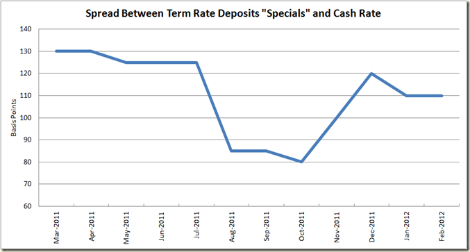
Anyhoo, here are the graphs:

image

image

image

image

Thursday, April 12, 2012

Unemployment, steady at 5.2%; media bull on carbon tax, increasing

The ABS today released the latest Labour Force figures.

The figures are quite good. Not “wow feel the rush of the air past your ears as the economy goes boom” good, but good nonetheless.

The Seasonal and Trend Unemployment Rates stayed steady at 5.2%. The trend rate has now been at 5.2% since last August. Employment grew by 44,000 in seasonal terms, and also up a touch in trend terms as well. Full-time employment increased 15,800 (0.2%) and part-time employment increased 28,200 (0.8%). Again, nice to see.

image

[UPDATE: I forgot the golden rule that every post about the economy must mention interest rates. I think these figures give little reason for the RBA not to drop rates. The trend is still very flat.]

In other good news the number of hours worked rose in trend terms for the first time in 6 months

image

There was also a nice 2% in crease in the participation rate (seasonal terms)

image

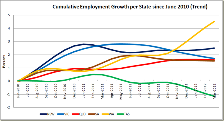
The big growth came in the NSW, but all states did well except poor old Tassie:

image

And to update my graph from yesterday on the cumulative growth in employment in each state since 2008, we see WA having fun in the sun, and Tasmania really in the depths of despair.

image

The Employment to Population rate also rose in seasonally adjusted terms, but continued its decline in trend terms to a run of 14 months. We are still a whole percentage point below where we were prior to the GFC.

image

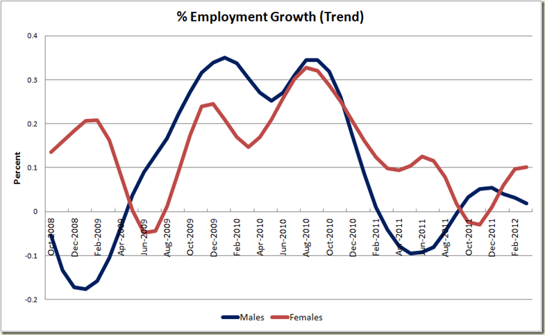
Women were the big winners this month – their employment growing by 0.1% in trend terms compared to males going up by 0.02%

image

And now the monthly, “Hey America and the UK – How you doing?”

image

***

With the Carbon Price to come into effect in July, the ACCC is supposedly going to be hot on any company spouting bullshit about the impact – to whit you are not allowed to claim the carbon price is the reason prices may be rising if they are actually not the reason. The ACCC gives examples such as:

  • ‘Beat the Carbon Tax – Buy Now!’
  • ‘Our prices will be hit hard when the carbon price comes in’.

They also suggest you can’t fraudulently say thing like:

  • Our prices have increased by X% because of the carbon price’.

Well businesses need not worry. They don’t need to make such claims. It seem the media are at hand to do such work for them. Today on The Australian's website we had this little headline:

Carbon tax bull The Australian

The headline is pretty definitive: The Carbon Tax will add $380 to power bills in NSW. Except the article (which came via AAP) contained this:

In a draft report handed down by the Independent Pricing and Regulatory Tribunal (IPART) today, the authority recommended an average price hike of 16 per cent across the state.

Price hikes will vary for the three regulated electricity retailers, with EnergyAustralia customers facing the biggest increase of about 19.2 per cent in their bills.

This could mean an extra $338 per year for households

Wait…. “could”? The headline didn’t suggest any “could” wriggle room. And doesn’t the headline say $380? So what is this “$338” figure doing here? Hmm read on:

Meanwhile, Country Energy customers could be slugged with a 17.6 per cent rise, or about $381 a year for households and $494 a year for businesses.

And Integral Energy could hike their prices by just over 10 per cent, or about $182 per year for households and $237 for small-business owners.

Ahhh so Country Energy uses could be paying $381 a year extra, but those who get electricity from other providers would be paying less of an increase. So really the $380 is at best an “up to $380”… Oh well, at least that up to $380 is all because of the Carbon Tax, right? I mean the headline couldn’t contain two misleading parts could it?

IPART chairman Dr Peter Boxall said the proposed increases were due in equal measure to the rising costs of the network's poles and wires and the introduction of the federal government's carbon price.

"Around half of the increase in NSW electricity prices from 1 July is because of the continuing rise in forecast costs faced by the retailers from the electricity network," Dr Boxall said in a statement.

"The other half is due to increasing wholesale electricity costs faced by the retailers resulting from the introduction of a carbon price on emissions from electricity generators."

So the carbon tax is the cause of half of the possible increases.

HALF!

I guess the subeditor was just too pig ignorant to be able to work out that half of $380 is not all of $380. Or maybe 380 divided by 2 was beyond his or her acumen.

So not $380. Maybe up to $190.

If any of the energy companies had put out media statements with a headline the same as The Australian’s I would suggest they would be in a world of hurt from the ACCC. But because The Oz is a mere news organisation, I suppose truth ain’t such a big concern. To write that the carbon tax will add $380 to NSW power bills is not merely misleading, it is a lie. And the lie is revealed in the actual report below the headline.

Is this a one off? Why no. All the News.ltd tabloids are running with Andrew Clennell’s story about jumps in energy prices. Clennell’s article begins:

ELECTRICITY bills are set to rise more than $300 - or 16 per cent - next year. Half of the rise has been blamed on the carbon tax.

And yet the headline in each of the news.ltd websites?

Bracing for $300 jump in power bill as the carbon tax hits

Yep let’s blame the carbon tax for the whole $300 worth.

Such headlines are why when journalists from certain newspapers tell me on Twitter that they just report the facts and their organisation has no bias I laugh loud and hard.

UPDATE Straight after posting this, rather coincidentally The Australian changed the headline on the story to this:

Carbon tax 'to add up to $380 to power bills in NSW' - The Australian

So now it reads:

Carbon tax 'to add up to $380 to power bills in NSW'

Except as we already know, the Carbon Tax will not add “up to $380” it will at worst add up to $190 (that is half of $380).

So not only have they got it wrong once, when they tried to correct it by making the headline look like a quote they STILL GOT IT WRONG.

That takes skill.

Wednesday, April 11, 2012

Drum post– “Budget debate in a sea of contradictions”

My Drum post today is here. It is on  the budget and God help me I decided to throw in some economic theory.

The graphs in the post are below, but here’s one that is not in it, but gives an indicator of how Australia got through the GFC compared to other nations. I like the graph because I think it is worth remembering that the GFC is not some little “cold” that the rest of the world caught, and we got through with just a small case of the sniffles. It was a bout of pneumonia that ripped through the systems of many of the world’s biggest economies and put more than a few into the IC Unit.  

Imagine being in the UK, Italy, Spain or France and knowing that your economy was bigger four years ago. Even Germany and the USA have only recently reached the point of growing their economies to positions bigger than they were at the start of 2008. Australian on the other hand is over 7% bigger than then. I know GDP hides a lot of things wrong with an economy, but geez.

I note this because this week Essential Media had a poll that showed that the largest block of people (28%) of people think the reason we have a budget deficit is due to “Poor economic management by the Government”. Now sure it is nowhere near a majority, but that only 13% think it is due to “Lower tax revenues because of the Global Financial Crisis” suggests this Government seriously has failed to write a decent narrative on economic matters in the past 4 years. But view is nothing new to any readers of this blog.

image

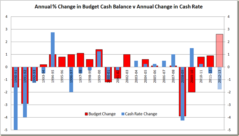
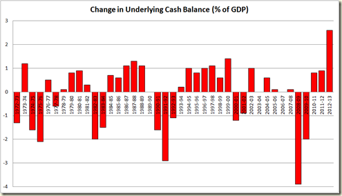
In the post I also have this graph that looks at the expansion and contraction in the budget each year compared to the change in the cash rate in that year

image

Here’s the same period but looking at GDP growth each year and changes in the cash rate:

image

Which I think shows that the RBA really can afford to drop those rates somewhat. Inflation is not the issue at the moment – growth is.

[Note – the “Antipodean Economist” on Twitter notes correctly that the above graph has fairly significant “endogeneity issues” – ie the things on the graph are affected by other things on the graph. That’s fine – but I think the graph does show that during the 2000s for eg, the RBA was prepared to just tap the brakes a little while growth and inflation remained around 3%. I am not suggesting for example change in the cash rate will lead to certain levels of growth or anything like that – because obviously the RBA makes decisions on the cash rate on the basis of things like growth and the inflation rate – ie in GDP growth did not decline in 2008-09 because the cash rate declined, more you can see that the RBA’s reaction to the decline was to lower rates]

image

image

image

Wednesday, April 4, 2012

Drum Piece–the budget surplus

My Drum piece for this week is here.

Below are the graphs used in a form that you can click to get the bigger size:

image

image

image

image

image

image