My Drum post today is here. It is on the budget and God help me I decided to throw in some economic theory.
The graphs in the post are below, but here’s one that is not in it, but gives an indicator of how Australia got through the GFC compared to other nations. I like the graph because I think it is worth remembering that the GFC is not some little “cold” that the rest of the world caught, and we got through with just a small case of the sniffles. It was a bout of pneumonia that ripped through the systems of many of the world’s biggest economies and put more than a few into the IC Unit.
Imagine being in the UK, Italy, Spain or France and knowing that your economy was bigger four years ago. Even Germany and the USA have only recently reached the point of growing their economies to positions bigger than they were at the start of 2008. Australian on the other hand is over 7% bigger than then. I know GDP hides a lot of things wrong with an economy, but geez.
I note this because this week Essential Media had a poll that showed that the largest block of people (28%) of people think the reason we have a budget deficit is due to “Poor economic management by the Government”. Now sure it is nowhere near a majority, but that only 13% think it is due to “Lower tax revenues because of the Global Financial Crisis” suggests this Government seriously has failed to write a decent narrative on economic matters in the past 4 years. But view is nothing new to any readers of this blog.
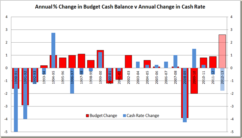
In the post I also have this graph that looks at the expansion and contraction in the budget each year compared to the change in the cash rate in that year
Here’s the same period but looking at GDP growth each year and changes in the cash rate:
Which I think shows that the RBA really can afford to drop those rates somewhat. Inflation is not the issue at the moment – growth is.
[Note – the “Antipodean Economist” on Twitter notes correctly that the above graph has fairly significant “endogeneity issues” – ie the things on the graph are affected by other things on the graph. That’s fine – but I think the graph does show that during the 2000s for eg, the RBA was prepared to just tap the brakes a little while growth and inflation remained around 3%. I am not suggesting for example change in the cash rate will lead to certain levels of growth or anything like that – because obviously the RBA makes decisions on the cash rate on the basis of things like growth and the inflation rate – ie in GDP growth did not decline in 2008-09 because the cash rate declined, more you can see that the RBA’s reaction to the decline was to lower rates]


1 comment:
The first graph is extremely interesting - would be good if you could add New Zealand though. After Abbott once said that we should have managed the GFC more like them.
Post a Comment