And so the ABS released the monthly employment figures came out today. The headline grabber is that unemployment stays at 5.2%.
But technically the unemployment rate fell from 5.3% in seasonally adjusted terms to 5.2%, it’s just that last month when the figures were released they had the rate at 5.2%. When the ABS calculated the June rate this time round it ticked just over 5.25% and thus got rounded up to 5.3%. The decline from June to July wasn’t actually a 0.1 percentage point increase, it was 0.02575 percentage point. So lets call it no change and be done with it.
In trend terms the rate did remain unchanged at 5.2%.
On the graph of the past 5 years it all looks like this:
Riveting.
One thing to note about the adjustments is that the adjustments are more marked in the trend rate that the seasonally adjusted rate.
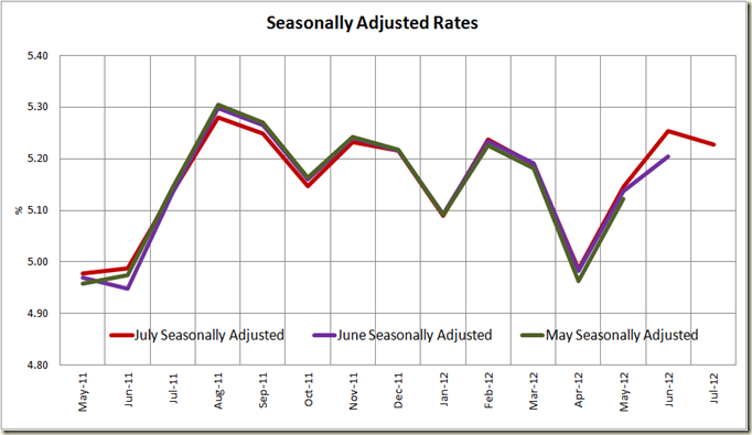
Here’s the different seasonally adjusted rates over the past 12 months as measured in May, June and now July:
Other than the June amount, there is not much difference. But now look at the trend rates in the same months:
Back in May the ABS estimated the trend unemployment rate was below 5.1%, and that it had been trending down for a good six months. In June the trend showed a definite flattening. Now the ABS shows that the trend rate had actually already started increasing in May (and perhaps a month or 2 before hand). Thus we know now that the labour market was doing worse in May than we thought then.
So yes, the trend is your friend, but always remember that a trend result inherently takes longer to adjust to changes. The Seasonally Adjusted rate however showed April was the start of the increase. The point however is that we only know now that is was a start. So don’t rely on just one measure, use both together.
Of course the unemployment rate is just one statistic, let’s look at actually jobs growth – both seasonally adjusted and trend:
After a big drop last month, there was an increase in seasonally adjusted terms of 14,000 (0.1%) to 11,512,600. Also Full-time employment increased 9,200 to 8,073,700 and part-time employment increased 4,800 to 3,439,000.
The trend is going down – due mostly to that big drop last month. We wait to see next month’s figures to see if June was an anomaly or indicator of things to come.
But anytime it;s going down is not a good sign, and also more so when you look at the growth in aggregate hours worked per month:
It’s all a little weak, really.
And finally forget all of this, we know only one figure really matters, and that’s the Employment to Population ratio:
It is flat, but has declined from the start of the year. This again shows that there is still a lot of weakness (and capacity) in the economy.
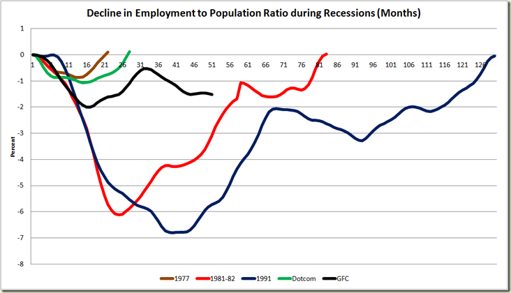
When we compare the decline in the employment to population ratio since the GFC hit, you can see we still haven’t got back to where we were in June 2008:
And if we compare that decline against other recessions, we see that the climb out of the GFC is mirroring the patterns somewhat of the 1981-82 and 1991 recessions where a recovery occurs before a decline. By this measure the rate should begin to climb soon.
Now to the states.
Interestingly, Queensland’s unemployment rates in Seasonal terms went from 5.3% to 5.8%, and yet it’s employment numbers increased – mostly because its participation rate also increased from 66.1% to 66.5%. Seasonal adjusted at the state level really jumps around, so here is it best to look at the trend, and again it’s all a bit flat.
In short, the unemployment rate is good – there are always caveats to the rate, but it remains a good indicator. But employment growth is pretty slight, and despite the RBA on Tuesday signalling no more reductions in the cash rate, I think what we see here is that the previous reductions still haven’t flown through, and given the way the trend rate of unemployment is going, I wouldn’t rule out another drop in rates before the end of the year.


2 comments:
nice work. The only issue I have is with the meaningfulness of the underlying data. For instance, my wife lost her job in Qld thanks to "Can Do". My own contract has been reduced to 60%. Still that is $10 a week too much for her to register as unemployed.
Certainly it was much easier to register as unemployed back in the late 90's than now.
What I'm saying is: do you trust that the data means what it implies it means?
the previous reductions still haven’t flown through
Flowed, from flow. Not flown, from fly.
But you knew that. :-) Thanks for the interesting words and pictures.
Post a Comment