First the obligatory, “less than analysists” expected sentence.
OK. Now onto the data.
Yep, the ABS in the midst of the quarterly economic nerd week, released the national accounts today. Growth was below trend. Even trend growth was below trend.
Where do we find ourselves? Well first let’s look at the quarterly growth picture:
In March I noted that “4 of the past 5 quarters have had growth below the 10 year average”. That stays the same by virtue of the September 2012 growth figure being revised up from 0.65% to 0.76%. Incidentally the March 2012 growth figure, which came out at 1.3% and which received a fair bit of derision, seems to have settled at growth of 1.24%.
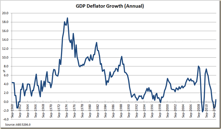
So the past 18 months have been more below average than good. And this month’s figures were a decline in annual terms due to that nice March 2012 growth no longer getting counted in the annual figures:
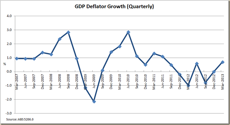
This quarter at least we saw a slight return to normal in terms of the GDP deflator. Unlike the past 3 quarters which has the implicit prices used to calculate the GDP declining in annual terms, this quarter shows the GDP deflator increasing by as still next to nothing 0.5%
If we go in for a closer look on a quarterly basis we see this:
Clearly inflation is not a problem at the moment.
So how does that flow through to the latest buzzword in economic reporting, Nominal GDP?
Well the is an improvement, but geez it is still a long long way below average:
As Wayne Swan lies in bed at night wondering of the surplus that might have been he must surely look at that period from March 2003 to Dec 2008 when nominal GDP growth averaged 7.9%.
Annual real GDP growth from March 2009 is around 25% less than it was from 2002-2000, but average nominal GDP growth has fallen by around 40%:
OK. Terms of trade, how’s the boom going?
First the long term picture:
There was a little, little increase in the March quarter. Let’s go in for a close up, which shows the boom as less of a bust than a slight falling off:
Is that a truer picture? Not sure to be honest.
OK. Onto productivity.
This quarter showed a slight slowing of growth in annual growth in both trend and seasonally adjusted terms. This wasn’t surprising because the March 2012 quarter had shown very strong growth of 1.9% in seasonally adjusted terms. In the March 2013 quarter productivity grew by only 0.4% in trend terms and not at all in seasonally adjusted terms.
Annual productivity growth in trend terms remains nicely above the 1997-2007 average, but no time to get complacent (or to suggest the unions and the Fair Work Act are killing the economy).
Indeed the 5 year rolling growth chart shows since 2009 there’s been a good turn around in the declining growth of productivity:
Further to the “unions are in charge and destroying everything” narrative, there are the labour costs figures.
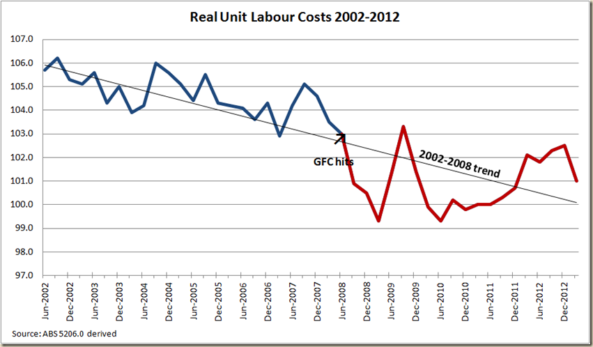
Real unit non-farm labour costs fell in the March quarter by 1.5% in seasonally adjusted terms.
Long time readers would note that I have been of the view that the reason behind the increase in unit labour costs during 2010-2012 was off the back of the GFC, which saw labour costs plummet faster than they had been. My view has been that we’ll get back to the pre-GFC trend of declining real unit labour costs once both the GFC and the reaction washes out, and this does seem to be the case. In essence, let’s cut the bull about the Fair Work Act raising labour costs.
Heck let’s look at nominal unit labour costs, because they are what the RBA looks at to see if labour costs are putting a spur to inflation:
Yep, nominal unit labour costs fell by 0.6% in the past year.
The household savings ratio shows that we’re quite happy it seems to save around 10% of our income.
Finally, on a national level, let’s look at the break down of national income among employees and companies.
After a bit of a jump last quarter, the employee share of total factor income stayed flat this quarter:
The corporations profit share of total factor income rose 3.7% in seasonally adjusted terms, but in trend terms it was pretty flat:
The increase in seasonally adjusted term might be good for tax revenue as we head towards the Pre-election Fiscal Outlook – as to might the slight increase in nominal GDP growth.
Now to the states.
Oh Western Australia, we hardly knew you:
Look, despite the usual caveats about state final demand not being state domestic product, it’s clear the peak of the mining capex has had an impact on WA. That doesn’t mean it’s in recession, but it is certainly off the boil (especially when you look at its employment growth situation).
Let’s look at it in annual terms, to clear out a bit of the quarterly variations:
WA’s annual SFD growth is now only just above that of QLD and NSW. (And yes, Tasmania is in a recession, let’s not beat around the bush). But while NSW has been kind of at a plateau, QLD continues its downward path.
How does the WA picture look in historical terms?
As you can see the last time WA’s annual SFD growth was this low (outside of the GFC) was prior to the mining boom.
Of course the non-mining states are meant to pick up the slack. Over to you Victoria:
As you can see, in the past 25 years there’s only been 2 other periods where Victoria’s SFD growth is negative – the 1990s recession and the GFC.
That is not a pretty picture.
Tomorrow the labour force figures. I predict not much joy there either.


4 comments:
Correct me if I'm wrong but aren't the GDP figures pretty much meaningless at this point in time. I say this because they are based on modelled assumptions and are subject to significant revisions over time. So all this commentary about weak or below trend growth may just be complete hogwash because the data is essentially made up until the real data can be incorporated into the figures.
Nope. Like all data it is subject to revisions, but it isn't essentially made up.
My understanding is that a significant proportion of the quarterly GDP figures are based on modelled data. Models which are based on previous annual / biannual or even 5 yearly data. Once this data is actually collected it is incorporated. My understanding is that the assumptions built into these models are unreliable around turning points. Therefore, if we are at a turning point the latest data is probably rubbish because it is based on modelled data that doesn't stack up. Thats why I refer to it as rubbish.
The RBA openly acknowledge this, they refer to it as 'revision bias' .
Good paper by the RBA
http://www.rba.gov.au/publications/bulletin/2013/mar/2.html
Conclusion:
"The above analysis illustrates that real-time estimates of GDP growth are subject to significant revisions, so users should be careful not to over-interpret quarterly changes based on early vintages of data. It also highlights the importance of gathering and monitoring a wide range of other timely data and information."
and
"...early estimates of GDP growth tended to understate ‘final’ GDP growth to some degree."
Seems to me everyone is getting a little excited over very little. Colebatch's article was a classic example of this...a journalis with his experience should know better.
Post a Comment