My Drum piece this week is on last week’s unemployment figures, and has a look a bit deeper than just the usual big number – using a few bits of data which regular readers will have seen a fair bit of on this blog.
For some reason a couple of the graphs went screwy on the website (or they did for some, but not for others – apparently this is because they’re in jpeg form, so I’ll use PNG or GIF in future) so here they all are in nice size (and crucially you can click on them to get a bigger view – God knows why that can’t happen on The Drum site). My favourite one is at the end, I think it captures the :
The seasonal figure jumps around much more than the trend (not surprise – it’s not meant to)
The revision of the trend rate in April shows a rather different picture to what was seen in March
Trend employment growth is positive, but pretty weak and flat
Participation continues its fall from the record high of October 2010
Hours worked shows four months of positive growth, but has it peaked?
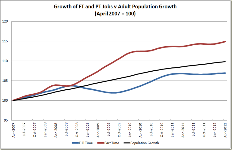
Full time jobs can’t keep pace with population growth (thanks Matt Cowgill – for the graph, not the lack of FT employment, but then he works for the ACTU, so no doubt he and his “wages breakout” are to blame :-) )
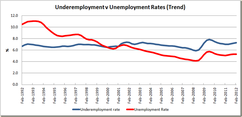
Underemployment is pretty flat, and since 2005 it follows the movement of the unemployment rate.
During the GFC the big fall was not in employment as a percentage of population, but hours worked per person – ie cut back in hours rather than sackings.
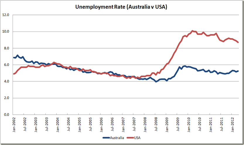
Looking at unemployment rates, you’d think the USA and Australia were similar in the 2000s, and that the USA doesn’t have too far to get back to equal with us
Looking at employment to population ratio shows just how different our economies were in the early to mid 2000s, and how big a hole the USA is in.
Plus here’s one other – the Australian dollar is on a serious sliding right now, the red line is the price since the RBA dropped the cash rate on 1 May:


No comments:
Post a Comment