The ABS continued economic stats-week by releasing the Labour Force Data. The seasonally adjusted figure (the one the media focuses on) rose to 5.1%. Last month the figure was 4.9%, but as I noted in my Drum piece in May:
… given that the seasonally adjusted unemployment rate for April was (in full) 4.9443488 per cent, it won't require much revision to get it to 4.95 per cent and thus rounded up to 5.0 per cent when next month's figures are released.
And sure enough today the April figure came in at 4.9624381 and thus was revised to 5.0%. But just to confuse you even more even though the figure was revised to 5.0 and May is 5.1, it was an increase of 0.2% because the actual change between the 2 months is 0.1591682 (ie rounded to 0.2!)
As ever – the trend is your friend and that stayed steady at 5.1%
The ABS notes:
Employment increased 38,900 (0.3%) to 11,537,900. Full-time employment increased 46,100 (0.6%) to 8,107,900 and part-time employment decreased 7,200 (0.2%) to 3,430,100.
The graphs shows that employment is solid. The trend level is plateauing a bit, but it’s better to be flat at 0.15% growth than at 0% which is where it was much of last year.
Thus the increase in the unemployment rate came not from a loss of jobs, but due to more people entering the labour force – ie looking for work – the participation rate increased:
And thus there was an increase in my favourite stat of the employment to population ratio:
And while hours worked in seasonally adjusted terms fell by 0.3%, I think the seasonally adjusted measure for that is just too erratic to get anything meaningful from it
And so I prefer the trend figure – which actually shows an increase in May:
A comparison of employment to population ratio and Average Hours Worked per Person also shows there is still scope for hours worked to increase – ie there is still spare capacity in the labour force :
And on the employment to population ratio, while it is getting better, it is still not back to where we were prior to the GFC:
This is one reason I would suggest we are seeing strong GDP growth, good employment growth, but not a big increase in wages – ie if you think there is such a thing as “full employment” we’re not quite there yet (though I’d argue we’re not far off it)
A look at the break down of the sexes shows women doing better than men:
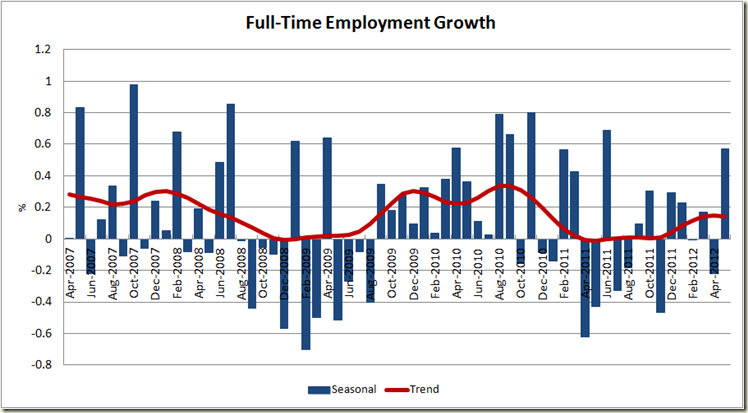
This month, as opposed to last month saw in increase in full-time work, another good sign:
And finally the growth in the state was reflected like this:
Tasmania!! Boom time!!! Well maybe not. But the QLD figures do show that, much as was the case with the GDP figures yesterday, it is not as dependent on mining as is WA, and other areas – especially tourism come into play.
So all in all these figures are good, and to find something bad to say here, you need to spin the figures pretty hard. They certainly do not reflect the doom that many in the media who didn’t like yesterday’s GDP figures predicted for the June quarter. As Christopher Joye noted, had the RBA had both these and the GDP figures released yesterday there is no way it would have reduced the interest rate by 25 basis points. It’s hard to disagree with that.


1 comment:
nice one ... clear
Post a Comment