Today the RBA decided to cut the cash rate by 25 basis points to 3.5%. This was no doubt a shock to Tony Abbott who yesterday was saying:
“We’ll get taxes down, we'll get spending down and that can take the pressure off interest rates.''
Given the only pressure on interest rates is downward pressure, I guess this means his Government will do all it can to reduce that…
The RBA mostly cited overseas concerns:
Financial market sentiment has deteriorated over the past month. The Board has noted previously that Europe would remain a potential source of adverse shocks. Europe's economic and financial prospects have again been clouded by weakening growth, heightened political uncertainty and concerns about fiscal sustainability and the strength of some banks. Capital markets remain open to corporations and well-rated banks, but spreads have increased. Long-term interest rates faced by highly rated sovereigns, including Australia, have fallen to exceptionally low levels. Share markets have declined.
…
At today's meeting, the Board judged that, with modest domestic growth and a weaker and more uncertain international environment, the outlook for inflation afforded scope for a more accommodative stance of monetary policy.
Once again the RBA continues to neglect to cite that we have in power the worst Government since Whitlam. Disgraceful oversight, really.
Anyhoo here is the graph of the cash rate over the past 20 years. The rate is now 3.50%, well below the 20 year average of 5.38%
Now as we all now, we don’t get the cash rate for our home loans, so assuming the banks only pass on 80% of the cut like they did last month, here’s the chart of the standard variable rate:
At a projected 6.85%, it is below the 20 year average of 7.78%. (Also note the standard variable rate in November 2007 was 8.55%)
The small overdraft for small businesses picture is below:
Here the projected rate of 10.4% is above the 20 years average of 9.85% – though just below the November 2007 rate of 10.90%.
Last month banks passed on only half of the 50 basis points cut in the cash rate to the small overdraft rate. It’s why talk of monetary policy is all well and good, but currently the impact is most occurring on the consumer side, not the producer side – this will necessarily weaken the stimulatory impacts of any drop in the cash rate. The Liberals can rant all they want over averages and where the rates are now compared to where they were when, but until it can explain how it will reduce the current spreads between the cash rate and the standard variable and small overdraft rates, then they’re just blowing smoke up everyone’s arse.
Out of interest here (via the RBA) is a graph of the variable home loan rate since 1959.
The 53 year average is 8.75%.
I might write a bit more about interest rates in my Drum piece next week. If not, I’ll post the graphs I’m messing around with at the moment here next week.
***
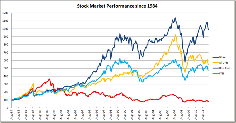
Yesterday there was a bit of talk around about the poor performance of the Japanese stock market and how it was below levels seen in the 1980s. I thought I’d have a look at how the USA, Japanese , UK and Australian stock markets have gone since 1984 (the earliest I can get complete comparative figures)
It’s not a pretty picture for Japanese.
And incidentally here is the performance of the Dow Jones Index since 1928.
The scale does exaggerate the recent movements a bit, but still…
Justin in the comments suggests I do a log scale graph to show better what has been going on since 1928. Good idea:
It shows just how the Great Depression bottomed out in 1929-31, and also depicts the post-war boom quite nicely. Then there is the flatness from around 1965-1982 and then boom again. [in an earlier draft I referred to the stock market crash of 1927, which of course should be 1929, bit of a brain flub there!]
And for something completely meaningless, given economies don’t reset each decade, here’s a comparison of the performance of the Dow Jones in each decade from the 1970s (I originally had just from the 1970s, but I got a bit excited and decided to throw in the 50s and 60s – I also used monthly measure, rather than daily):
The 2000s and the 1970s bookended the two boom decades of the 1980s and 1990s, but it’s interesting to note of the 6 decades, 3 have been good, 3 have been poor. No middle path. Again, don’t read too much into it – the start and finish of a decade is purely arbitrary and means nothing economically speaking, but given we often speak of the 50s or the 60s, it’s interesting that the 1960s were in no way the boom that were the 1950s. You’d almost think about half way into the decade America got itself stuck into a long, drawn out war in Asia… .
Of the three decades that ended up performing poorly, only the 1970s was doing as well as is the 2010s currently. In fact 30 months in the 2010s are just below where the 1990s and 1970s were at the same point. But whether it will go like the 1990s or 1970s this graph gives no hint. Right now, I’d bet the 1970s.


3 comments:
Maybe throw a log scale in there for the historical stock charts?
Good idea, Justin
i need your help this is for my assignment and really hope you can share your knowledge with me. i know that the price stability decrease in April 2012 compare to April 2011. do you know why the ps rate decrease? Thanks
Post a Comment