Wednesday, April 24, 2013

Australia’s March Inflation – Down Down, Prices are Down…..

The CPI figures for the March quarter were released today by the ABS, showing a next to nothing change of 0.1% in seasonally adjusted terms (0.4% in the original data, if you like that sort of thing). This means in annual terms the rise was 2.5% or smack bang right in the middle of the RBA’s 2-3% band.

OK First the long term view:

image

Now let’s look at the past 10 years, and now we’ll convert to seasonally adjusted (the seasonally adjusted data only goes back to 1986):

image

It’s worth noting that the average inflation in that time is 2.8%, and if we go back 20 years it is 2.7%. So prices are increases slower than average. But it’s not surprising that the annual rate increased over the last period because the last period included the March 2012 quarter which actually had negative growth – ie deflation.

Even still, in quarterly changes it is a mere 0.1% which looks like this:

image

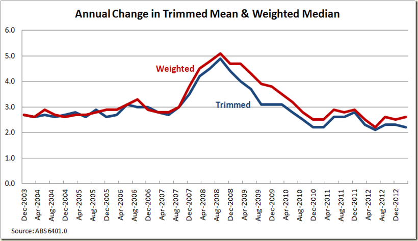
Now we all know the Reserve Bank looks at the Weighted Median and Trimmed Mean versions, so how do they look?

image

Again even though the quarterly changes are rather sharp and jagged, you can still see how low inflation is running.

The picture becomes even clearer when we go to the annual growth:

image

So what does it mean for interest rates? Well the 2.2% trimmed mean and 2.6% weighted median won’t have them worrying about increasing rates to curb inflation, and even if we “annualise” the quarterly increase we’re only looking at 2.0% of a weighted median and 1.2% on the trimmed mean rate. That is seriously low.

In short inflation is not a problem despite suggestions the rate cuts last year would send prices souring given the economy was running at trend. Why didn’t this happen? Mostly because the economy might have been running at trend, but it sure wasn’t when the RBA started cutting rates, and also there is a lot of spare capacity in the market, and also that high Aussie dollar is keeping import prices in check (see below).

Now I know this must be a shock to those who thought the the carbon tax would unleash the hell of inflation upon us. After all someone who has claims on being Prime Minister keeps telling us that the carbon price will cause prices to go up and up (“and that’s just for starters”).

So let’s look at electricity:

First annual terms:

image

Clearly a big boom occured in the September 2012 quarter. But what’s happened since? Let’s go to the quarterly measures:

image

In the March Quarter there was a 2.4% in crease in electricity, well down from the 15.3% one in the September quarter last year which took the brunt of the carbon tax changes.

But is 2.4% a big increase? The problem with the ABS data on individual sectors is that it is not adjusted for seasonal variances, so let’s just look at the March Quarters to see if we can get any sense of whether 2.4% is a big jump for that time of year:

image

It’s actually the lowest quarterly increase in a March Quarter since 2007.

It’s also worth remembering that electricity prices only account for about 2% of the basket of goods that are used to collate the CPI. For context, Take Way food accounts for 2.62% and Tobacco accounts for 2.32%.

If you exclude alcohol and tobacco from the data, the CPI quarterly increase falls from 0.4% to 0.2%. If you exclude Housing (of which electricity is around 9%) then the CPI would have risen by only 0.1%.

Here is the CPI excluding a few elements (so the lower it is the bigger the rise of that element):

image

The big impacts were housing, insurance and financial services; and housing in general. Education also saw a big jump (not surprisingly given it’s the start of the school year.

But let’s look at annual price increases and get it down to more detailed categories. Don’t worry about the weightings of each of these, but here are the top 20 and they might be of interest if you think you’re rather different to the “average household” and you consume a lot more poultry than most. Electricity and Gas are not surprisingly right up the top:

image

And the bottom 20? Not surprisingly lots of stuff that gets imported fell in prices. As did Lamb and goat, which given Barnaby Joyce suggested the carbon tax would lead to $100 lamb roasts seems rather interesting

image

Thursday, April 18, 2013

Drum Piece: Progressive tax and Flat Tax redux

My Drum piece this week was looking at suggestions the progressive income taxation is a bad thing, and that Australia has an overly progressive tax regime.

Among the graphs I used was the average tax wedge form the OECD data. One other lot of tax wedge data they released was "marginal tax wedge” which essentially looks at the rate of tax you pay for working say an extra hour – essentially what impact the income related taxes have on the incentives to work more.

image

Clearly Australia's rate is no less of a disincentive to work more than is the case in America, and we are a long, long, long way from the stereotypical high progressive taxing countries of Scandinavia.

And if we look at what the tax wedge is for your typical family with 2 kids, one parent at 100% of the average wage and the other at 33% (ie a part time worker), then again we see that Australia’s tax system is hardly a factor in people deciding whether they want to work more hours.

image

Now over at Catallaxy Files Sinclair Davidson has rather oddly accused me of “slight of hand” with my graphs on average tax rates of the flat rate because I chose a rate of 35%.

This rather surprised me because I chose it not for any nefarious means, but because that was the rate recommended by the Henry Tax Review as I noted in my blog post on the topic a week ago. The difference of course is the Henry Tax Review kept in place the 47% threshold for those earning over $180,000.

The Henry Tax Review Version looks like this compared to the current one:

image

And in terms of difference in tax paid as a percentage of income it would be this:

image

So I just kept the 35% rate but knocked off the 47% higher rate.

My point was that those in favour of a flat tax do so because it will lead to less taxation being raised and thus smaller government outlays – ie smaller government overall, and that it also favours the rich because they are the ones who currently pay the highest tax rate. As my final sentence states:

“When [the flat tax debate comes], remember what the fight is really about - the wealthiest paying a lot less tax, and a lot fewer services for everyone else.”

I guess I could have looked for guidance from Sinclair’s IPA 75 big ideas where they call for a flat tax. But oddly they’re not too desirous to put a number to it. But hey, I’ll play along.

Let’s compare the difference if the rate was 25%

image

Certainly everyone now is paying less tax. Let’s see how much less according to income: [UPDATE – My original graph was wrong, I’ve corrected. Not sure if anyone noticed, but anyway, thought I’d get in before anyone did!)

image

A big drop that just keep getting bigger. And once again – as I wrote in my article – that is always going to be the case when either moving to flat tax or just making your tax less progressive – the more you earn the bigger your tax cut.

Someone on the current median taxable income of $46,000 gets a tax cut of 2%, someone on $180,000 gets an 8% cut. Someone earning $548,000 (which is the average taxable income of those in the top 1% of incomes) would get a 16% cut.

I guess they just need it more.

But the bigger point is not that this is less-progressive, it is that it will bring in a shirtload less tax revenue. Now flat taxers no doubt like that. There may be a few deluded ones among them who think our current marginal tax rates are to the right of the Laffer Curve, but let’s stay in the realms of reality and assume (oddly) that if you tax people less, less tax is raised.

Well that’s fine. But when you’re looking at around an average 16% reduction in tax for those in the top 1% of the population, that would see the top 1% going from paying on average 41% of their $49.9 billion in collated taxable income to just around 23% which would see a drop of about $9 billion less in revenue just from the drop in tax paid by that 1%. And that’s each year. And remember the top 1% might pay a skewed amount of tax, but it is still only 9% of total tax. And remember as well income and withholding tax accounts for around 50% of all tax revenue, so we’re talking a massive smash to the budget.

And now you see why the IPA and those at Catallaxy love the flat tax. Less revenue means less government. Now that’s fine, but let’s not pretend that the above graph is just the only picture. Less tax revenue means less government services, be they education, health, social security, etc. Now they would of course argue that there won’t be so much of a need for government assistance or services because due to the income tax cut everyone will be doing so much better and will be able to pay for private health, education and other services that are currently provided through taxation.

Sure they will.

Thursday, April 11, 2013

March Unemployment Rate–Up to 5.6%

Well now. What an interesting set of numbers. Have had a bit of a long day, so there’s a stack of graphs, but the writing is at a minimum.

Today the ABS released the March labour force data and we see the unemployment rate rising to 5.6% in seasonally adjusted terms and steady at 5.5%. I say “steady” because last month it was 5.4% (or 5.388%), this month the February 2013 trend figures has been adjusted to 5.5% (or 5.455%)

The headline figures comes off the back of a fall in total employment in seasonally adjusted terms of 36,100 or 0.311%. This makes it the biggest fall since March 2003

image

Which is rather interesting since February employment growth figures were the strongest in nearly a decade:

image

Now a month ago when those figures came out everyone was pretty sceptical about them- and expected some adjustment to occur. And adjust the figures they did. They adjusted them up

image

So it’s not that the February figures were wrong, it’s that there seems to be a fair bit of volatility in the figures at the moment. It might be the case that the seasonally adjusted data is carrying on like a teenager who has just started drinking Red Bull with raspberry cordial chasers. Perhaps it’s time to go trust Mr Trend who is rather more sedate – sedate like an old stoner whose just slapped on a Bob Marley record and has popped down in a bean bag to chill man.

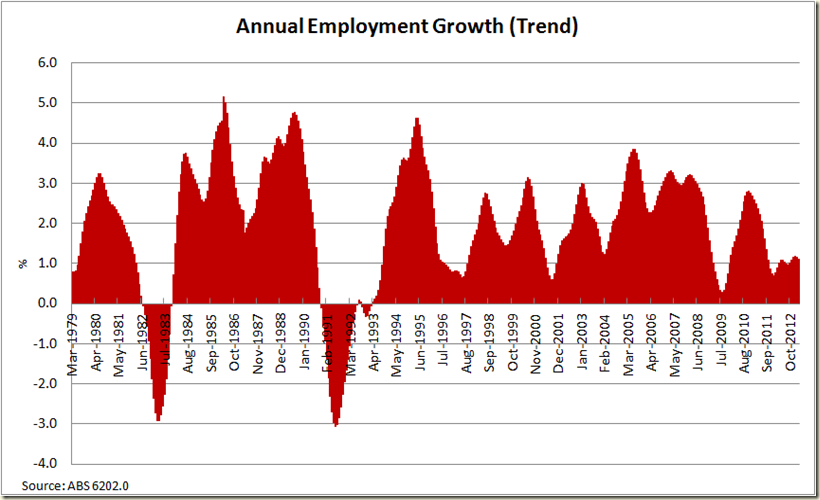
Speaking of chilling. Let’s look at the annual growth rate over the past 10 years. As you can see clearly, we got out of the GFC without going backwards in any year, but after 2010 finished things went downhill fast, and since 2012 began the upswing has been rather cool:

image

Look at the past 30 years to get some perspective:

image

We’re certainly not in recession territory, but you can see that the periods where the 1% growth line is visible is not a sign of health, and we’re just above that.

OK. Here’s the unemployment rates in the past 5 years:

image

Certainly seeing a bit more *up* in the formerly flat line from September 2010. But let’s go in for a closer look. Last month I said of the 12 month graph:

“Is the “flatness” a plateau or the top of a summit?”

Well that flatness ain’t really there anymore:

image

So let’s now look at the participation rate – last month there was a big spike. This month the spike has been reversed (and the trend rate stays at 65.1% where it has been since September 2012):

image

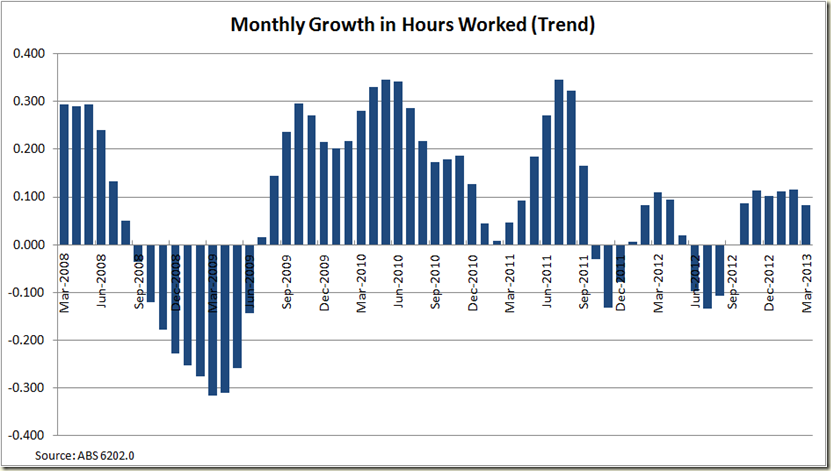
Now onto the hours worked. The seasonally adjusted figure went down a touch but as usual I’ll focus on the trend growth:

image

The interesting aspect for this is productivity for the March quarter. As productivity is GDP per hours worked, and as growth in hours worked was pretty much the same in in the December quarter (as you can see the last 6 columns are pretty much the same), it suggests if GDP grows by as much as it did in the December quarter – which was a mere 0.6% then productivity should again be pretty solid. We wait and see what those March quarter figures hold (don’t hold your breath though, they only come out on the 5th June).

There was a drop in full time employment this month:

image

There was also a drop in Part-time employment. This was the big aspect that led to the overall drop in employment. The seasonally adjusted figure certainly does jump around , so looking at the flatish, but positive trend term makes it easy to gauge what’s going on:

image

And now if we compare the unemployment rate with that of people looking for full-time work we see a pretty constant move up since March 2011, and a big jump in those looking for full time work last month:

image

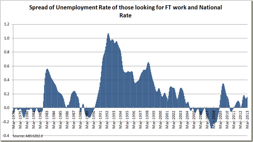
When you look at the difference between the 2 rates (in trend terms so things aren’t so jagged), it’s clear that the more the rate of those looking for full time work goes above the total rate, the more the economy is in trouble. We’re not “in trouble” yet, but you wouldn’t want to gap to get any closer to the 0.2 percentage points:

image

And now to add a bit of sex to economics... who did the best last month?

image

Women. Just.

The employment to population ratio continues it’s sad tale:

 image

That ageing population combined with a pretty weak labour market is not doing good things on this score.

image

Now to the states:

As ever the seasonally adjusted can be erratic

image

So let’s look at the trend data instead:

Looking good for QLD and NSW, but not great for WA! Whaaaat??

image

So let’s see the annual data:

image

That looks a bit more sensible.

And now the the unemployment rate minus each state.

image

Queensland remains the biggest drag on the national account:

image

And that’ll do use for another month. Not great – 5,6% is certainly above where you’d like to be, but the trend of 5.5% at least gives us some hope that the March figures were just a bit of a blip to go along with the opposite sided blip in February.

Wednesday, April 10, 2013

Drum Piece: Socio-economic Advantage and Disadvantage around Australia

My Drum piece this week makes use of the census data released by the ABS a couple weeks ago that makes use of the Indices of Relative Advantage and Disadvantage. I’ve actually been quite surprised that these haven’t received broader coverage. The data is brilliant and given you can break it down to suburb level – or even small if you want, I would have though they’d be great for news sites to put on their pages so people could play around with them.

While the graph you can construct are quite fun, the maps via Google Earth are fascinating.

Remember the darker the blue the more advantaged the area is (and this is SA1 level – about 400 persons) , the darker the red the more disadvantaged.

First Sydney:

IRSAD Sydney

Some pretty stark pockets of deep red, well away from the wash of blue north of the harbour and around Bondi and the inner suburbs.

Melbourne:

IRSAD Melbourne

It certainly isn’t a case of the rich and poor living cheek by jowl.  The red is in three very distinct areas.

Brisbane:

IRSAD Brisbane

The map is kind of disturbed by the big blog of red for the airport area, but it’s clear Ipswich way and to a lesser extent up around Redcliffe things are less advantageous

Perth

IRSAD Perth

I really don’t know Perth at all, but I’m thinking if you want to buy some cheap real estate, don’t bother anywhere within walking distance of the Swan River.

Adelaide:

IRSAD Adelaide

What strikes me about Adelaide is how much red there is compared to the other cities. Here the blue has spread to the outskirts – mostly the hills area to the south east.

The great thing about the date being at SA1 level is we can go in for a close up – say of Kate Ellis’s electorate of Adelaide:

IRSAD Adelaide electorate

This isn’t all her electorate – there’s a few bits around the top and bottom right that are Chris Pyne’s electorate of Sturt and some of the top left is Hindmarsh, but broadly this is the area she represents.

The little island of North Adelaide is very well heeled to say the least. Though some of the bluest parts would include university college residences and a lot of doctors surgeries and the like. Here electorate office is in Nailsworth which is just above and to the right of Prospect.

Hobart:

IRSAD Hobart

Darwin:

IRSAD Darwin

And finally the (let’s be honest) pretty advantaged Canberra:

IRSAD Canberra

And for those who are interested here are the top 20 most advantaged suburbs in Australia. You need to be a little bit careful, because obviously a smaller suburb is going to be less likely to have a distribution of numerous levels, but all the same:

State Suburb Name Usual Resident Population Score
North Coogee 582 1196
Pullenvale 3177 1195
The Ponds 2932 1191
Brookwater 1462 1189
Northwood (NSW) 915 1189
Linley Point 396 1188
Longueville 2097 1188
Forde 2320 1186
Forrest (ACT) 1464 1179
Dalkeith 4256 1179
Burns Beach 1608 1178
O'Malley 870 1175
Clontarf (NSW) 1693 1175
St Ives Chase 3082 1173
North Wahroonga 1884 1172
Balgowlah Heights 3266 1172
Castlecrag 2965 1172
East Lindfield 3625 1171
South Wharf 63 1171
Riverview (Lane Cove - NSW) 3161 1171

Here’s North Coogee, which is in Melissa Parke’s electorate of Fremantle:

Coogee

As you can see, even though her electorate takes in the most advantageous suburb, she’d do well not to just focus on it. Indeed here’s her electorate compared to the average of Australia:

image

It certainly is not a poor electorate – certainly above average, but still containing a significant number of who are pretty much within the norm of lower to median advantage.

Which is why in my Drum piece I looked at the spread of deciles to come up with Mitchell as the most advantaged electorate. It’s distribution looks like this:

image

At the other end we have the 20 least advantaged suburbs:

State Suburb Name Usual Resident Population Score
Binjari 240 298
Greys Plain 194 433
Daguragu 192 462
Wilora 112 465
Wami Kata 174 468
Thamarrurr 190 475
Amoonguna 276 488
Cabbage Tree Island (Ballina - NSW) 99 494
Murrin Bridge 98 503
Wutunugurra 206 511
Point Pearce 118 521
Gapuwiyak 875 522
East Arnhem 1455 522
Muli Muli 166 524
Ampilatwatja 364 529
Purfleet 157 532
Mossman Gorge 99 535
Beswick 510 537
Willare 128 537
Wilton (NT) 100 540

Predominantly Northern Territory, outback WA, SA and NSW.

Binjari is in the electorate of Lingiari held by  Warren Snowden, here’s it’s distribution:

image

Which rather starkly shows the disadvantage levels of many indigenous areas in Northern Territory.

***

UPDATE

As a commentor has pointed out I have incorrectly referred in my Drum piece to percentiles instead of deciles. Percentiles of course are hundredths and deciles are tenths. Last week in my piece on middle incomes I was working in 10 percentile lots ie the 90th percentile, the 80th, 5t0h etc. And thus this week when I was doing the graphs etc and using declies, in my head for some reason I was still using that same thought process of 10th percentile breakdowns. Which is why I referred to top 3 percentiles instead of top 3 deciles even though I was meaning decile. While the graphs are not changed at all, the meaning of them of course is – there’s rather a big difference between top 3% and top 30%.

My only defence is that the logic of my argument isn’t changed ie with repsect to advantage/disadvantage etc (because as I say I was thinking in 10 percentile lots, so when I wrote top 3 percentiles I always meant top 3 deciles, but had a brain flub and wrote percentiles). But still. No excuse. Deeply embarrassing.  

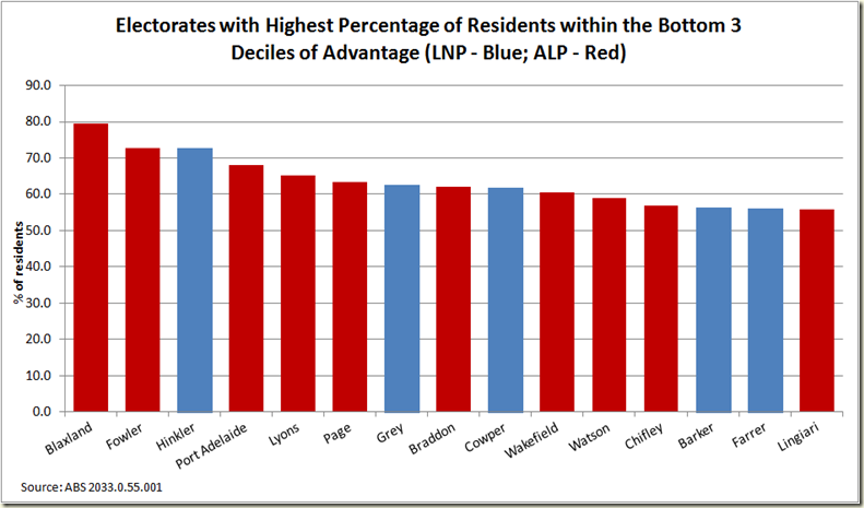
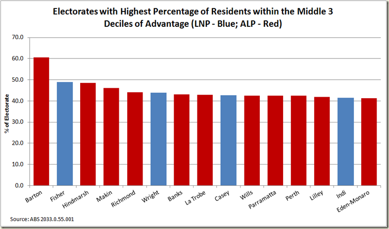
So here are the graphs as they should be (ie looking just the same but with the headings correctly labelled so they now are accurate):

image

image

image

image