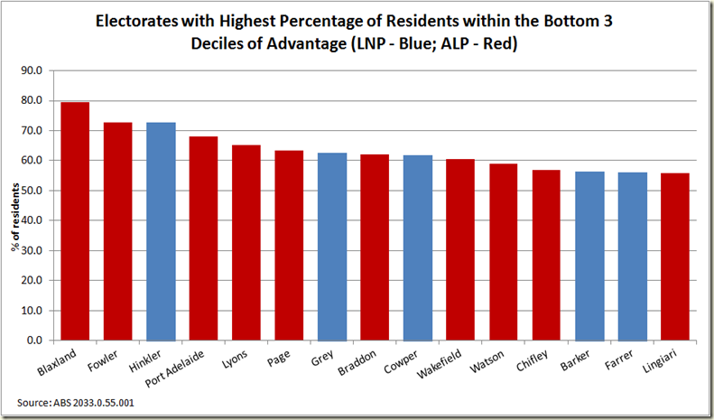
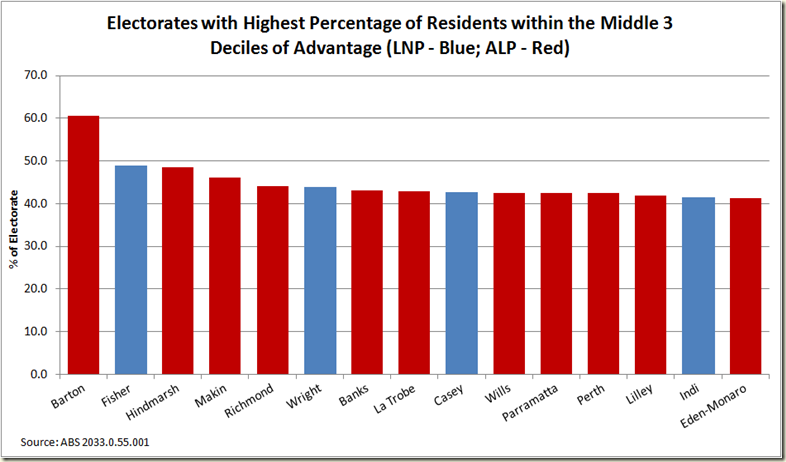
My Drum piece this week makes use of the census data released by the ABS a couple weeks ago that makes use of the Indices of Relative Advantage and Disadvantage. I’ve actually been quite surprised that these haven’t received broader coverage. The data is brilliant and given you can break it down to suburb level – or even small if you want, I would have though they’d be great for news sites to put on their pages so people could play around with them.
While the graph you can construct are quite fun, the maps via Google Earth are fascinating.
Remember the darker the blue the more advantaged the area is (and this is SA1 level – about 400 persons) , the darker the red the more disadvantaged.
First Sydney:
Some pretty stark pockets of deep red, well away from the wash of blue north of the harbour and around Bondi and the inner suburbs.
Melbourne:
It certainly isn’t a case of the rich and poor living cheek by jowl. The red is in three very distinct areas.
Brisbane:
The map is kind of disturbed by the big blog of red for the airport area, but it’s clear Ipswich way and to a lesser extent up around Redcliffe things are less advantageous
Perth
I really don’t know Perth at all, but I’m thinking if you want to buy some cheap real estate, don’t bother anywhere within walking distance of the Swan River.
Adelaide:
What strikes me about Adelaide is how much red there is compared to the other cities. Here the blue has spread to the outskirts – mostly the hills area to the south east.
The great thing about the date being at SA1 level is we can go in for a close up – say of Kate Ellis’s electorate of Adelaide:
This isn’t all her electorate – there’s a few bits around the top and bottom right that are Chris Pyne’s electorate of Sturt and some of the top left is Hindmarsh, but broadly this is the area she represents.
The little island of North Adelaide is very well heeled to say the least. Though some of the bluest parts would include university college residences and a lot of doctors surgeries and the like. Here electorate office is in Nailsworth which is just above and to the right of Prospect.
Hobart:
Darwin:
And finally the (let’s be honest) pretty advantaged Canberra:
And for those who are interested here are the top 20 most advantaged suburbs in Australia. You need to be a little bit careful, because obviously a smaller suburb is going to be less likely to have a distribution of numerous levels, but all the same:
| State Suburb Name | Usual Resident Population | Score |
| North Coogee | 582 | 1196 |
| Pullenvale | 3177 | 1195 |
| The Ponds | 2932 | 1191 |
| Brookwater | 1462 | 1189 |
| Northwood (NSW) | 915 | 1189 |
| Linley Point | 396 | 1188 |
| Longueville | 2097 | 1188 |
| Forde | 2320 | 1186 |
| Forrest (ACT) | 1464 | 1179 |
| Dalkeith | 4256 | 1179 |
| Burns Beach | 1608 | 1178 |
| O'Malley | 870 | 1175 |
| Clontarf (NSW) | 1693 | 1175 |
| St Ives Chase | 3082 | 1173 |
| North Wahroonga | 1884 | 1172 |
| Balgowlah Heights | 3266 | 1172 |
| Castlecrag | 2965 | 1172 |
| East Lindfield | 3625 | 1171 |
| South Wharf | 63 | 1171 |
| Riverview (Lane Cove - NSW) | 3161 | 1171 |
Here’s North Coogee, which is in Melissa Parke’s electorate of Fremantle:
As you can see, even though her electorate takes in the most advantageous suburb, she’d do well not to just focus on it. Indeed here’s her electorate compared to the average of Australia:
It certainly is not a poor electorate – certainly above average, but still containing a significant number of who are pretty much within the norm of lower to median advantage.
Which is why in my Drum piece I looked at the spread of deciles to come up with Mitchell as the most advantaged electorate. It’s distribution looks like this:
At the other end we have the 20 least advantaged suburbs:
| State Suburb Name | Usual Resident Population | Score |
| Binjari | 240 | 298 |
| Greys Plain | 194 | 433 |
| Daguragu | 192 | 462 |
| Wilora | 112 | 465 |
| Wami Kata | 174 | 468 |
| Thamarrurr | 190 | 475 |
| Amoonguna | 276 | 488 |
| Cabbage Tree Island (Ballina - NSW) | 99 | 494 |
| Murrin Bridge | 98 | 503 |
| Wutunugurra | 206 | 511 |
| Point Pearce | 118 | 521 |
| Gapuwiyak | 875 | 522 |
| East Arnhem | 1455 | 522 |
| Muli Muli | 166 | 524 |
| Ampilatwatja | 364 | 529 |
| Purfleet | 157 | 532 |
| Mossman Gorge | 99 | 535 |
| Beswick | 510 | 537 |
| Willare | 128 | 537 |
| Wilton (NT) | 100 | 540 |
Predominantly Northern Territory, outback WA, SA and NSW.
Binjari is in the electorate of Lingiari held by Warren Snowden, here’s it’s distribution:
Which rather starkly shows the disadvantage levels of many indigenous areas in Northern Territory.
***
UPDATE
As a commentor has pointed out I have incorrectly referred in my Drum piece to percentiles instead of deciles. Percentiles of course are hundredths and deciles are tenths. Last week in my piece on middle incomes I was working in 10 percentile lots ie the 90th percentile, the 80th, 5t0h etc. And thus this week when I was doing the graphs etc and using declies, in my head for some reason I was still using that same thought process of 10th percentile breakdowns. Which is why I referred to top 3 percentiles instead of top 3 deciles even though I was meaning decile. While the graphs are not changed at all, the meaning of them of course is – there’s rather a big difference between top 3% and top 30%.
My only defence is that the logic of my argument isn’t changed ie with repsect to advantage/disadvantage etc (because as I say I was thinking in 10 percentile lots, so when I wrote top 3 percentiles I always meant top 3 deciles, but had a brain flub and wrote percentiles). But still. No excuse. Deeply embarrassing.
So here are the graphs as they should be (ie looking just the same but with the headings correctly labelled so they now are accurate):


6 comments:
Greg,
always love your writing but today I think you may have confused "percentile" with "decile".
Anon. Yes you are right they should be decile.
Hi Greg, I'd be careful using SEIFA to measure how wealthy an electorate is. The use of measurements such as car ownership and overcrowding of homes bias the rating against inner city/suburban areas. Having lived in both Mitchell and Higgins I can tell you, it's certainly not Mitchell that is the more advantaged of the two.
The reason 2013 tax brackets always go up isn't because of currupt politicians or failing banks or any of the mess that our country is in. Our taxes go up every year because we demand a cost of living increase.
Steve
I agree with you on the bias being towards the inner-city. You can certainly see that with regards the low performance of semi-rural areas.
Hi Greg,
Sorry, you misunderstand me. I was sayingn SEIFA us not a great measure for how wealthy an electorate is, as metrics such as car ownership and overcrowding of homes bias the rating against the inner city. Many very well offhouseholshsve just one, or no cars. There are also many wealty older residents who lck Internet access in high income areas such as Toorak, who would be weighted based on this measure.
Better to stick to straight income if measuring an electorates wealth.
Post a Comment