Holy wow. No one saw this coming.
The Labour force figures released to day by the ABS, showed that employment grew in February by a whopping 0.6% in seasonally adjusted terms.
Now I know 0.6% doesn’t sound like much, but to put it in some context, as stats wunderkind,Shane Wright, from the West Australian, noted soon after they were released, it was the biggest increase in employment in the month of January February since 1995. (He must have a seriously good spread sheet system going!)
There have been only 13 months this century where employment growth has been over 0.5%. That’s 13 out of 157 months. So let’s say this is a pretty good result. Here’s what it looks like over the past 5 years:
And if 5 years isn’t enough context for you, here’s the past 10 years:
Yep – it’s the second best month of employment growth in the past decade. Not too shabby.
I guess Glenn Stevens was on to something when he said before the economics committee last month, “Overall, there is a good deal of interest rate stimulus in the pipeline.”
There is a bit of debate about whether or not this figure is “real” given the ABS has revised its sample, and certainly the big surge is a bit more than you would have expected, so I say, look, let’s calm down. This is just an estimate, and will likely be revised next month, so it might fall below 0.6%, but I think you’d have to be the worst possible grouch to be thinking these figures are bad.
OK, to the unemployment rate. So we had a massive boost in employment, but the unemployment rate has… stayed flat.
It sits at 5.4% in both seasonally adjusted and trend terms.
The close up of the 12 month figures is interesting. Is the “flatness” a plateau or the top of a summit?
So why did the unemployment rate remain steady? Because of the increase in participation. Is this a cruel joke on Wayne Swan, that he can get a big boost in employment but no joy in the actual unemployment figure? No. The reason participation increased is because employment increased. People were coming back to the workforce. Were the situation such that employment wasn’t increasing, it’s likely participation wouldn’t have either.
The participation rate increased 0.3 percentage points from 65.0% to 65.3%. In trend terms it remained steady:
What this figure does however suggest is that the calculation of the ABS – both in terms of numbers employed and those in the labour force – has caused this jump. Again, this doesn’t mean the unemployment rate is false, but that perhaps the employment growth and the participation rate increase are a bit overstated. Next month might see things in a more sober light.
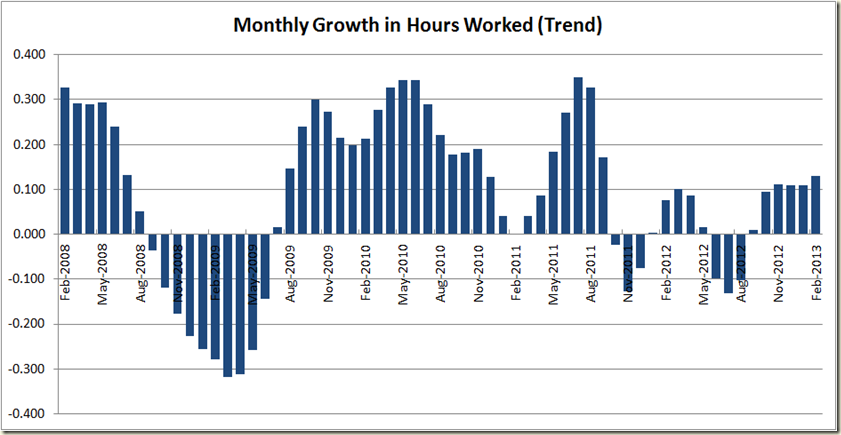
Now last months figures were revised as well, and whereas last month there was the estimation that the trend growth in hours worked had fallen, now we see a much different picture – an increase of .13% in February (and in seasonally adjusted terms a 0.7% increase in hours worked!)
The growth in hours is modest historically… and well that’s about all you can say about it. I’d like to get more excited, but I’ll go with suggesting this month that the trend really is your friend.
The good thing about the figures as well is that both full-time and part-time employment increased. Here though, we see the seasonally adjusted figures a bit more calm than the overall numbers, and the trend rate still showing negative monthly growth – a good calming statistic for those thinking boom time is here again.
As a result we see the unemployment rate of those looking for full-time work stabilizing with the overall rate, and both are down from the peak they were at 6 months ago:
The good news as well is that the employment growth has occurred for both men and women, but the growth in male employment does seem to have faltered a touch (but that’s really suggesting a bit more of the data than it is saying – it is pretty steady):
And we also see the unemployment rate stay steady for both
The number jump around again with the employment to population ratio – which remains flat at 61.6% in trend terms, but went up 0.3 percentage points in seasonally adjusted terms. Again, all good, but I’m sticking with the trend this month:
Now to the states, and here’s where we really see some weird things.
I‘m not a big fan of state seasonally adjusted numbers, because you see really bizarre things like the numbers we have for Tasmania:
The trend figures se Tasmania going from best to worst, and conversely, instead of QLD being the only state to decline , it becomes the biggest growing state!
So I’m calling a time out and saying, things look too weird for me. So let’s look at the annual figures to take a chill pill, and get some figures that make sense:
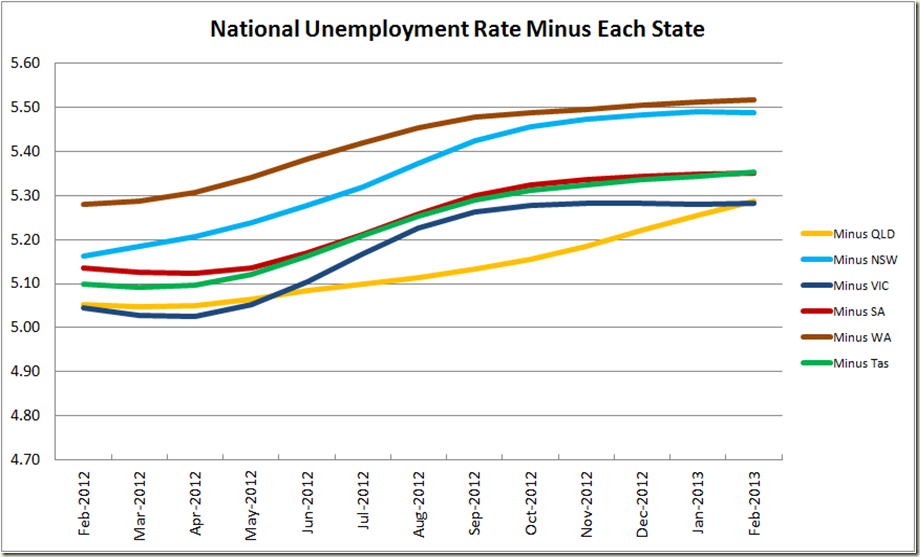
And now to the impact of each state on the national unemployment rate:
Queensland has improved from being far and away the worst state, to now tying with Victoria.
So in terms of drag on the unemployment rate, QLD and Victoria are both costing the nation about 0.1 percentage points on the national
So to recap. Big employment growth number in seasonally adjusted terms, but I think it’s safer to focus on the trend numbers, and also on the unemployment rate. Sure we had a big boost in employment, but the unemployment rate has remained steady, and I think that reflects how the economy is going quite accurately.


1 comment:
An ANZ (they do the monthly job ads survey) talking head said that a lot of the jump was due to a change sampling method. That this figure was well above what they expected from the Ads survey.
He said there was 5K new jobs in NSW, 4K in Qld, inferring the other states had much less growth. But at the same time he commented the Vic had 'bounced back'.
A bit confusing, but some points to think about.
This was part of an ABCnews24 interview.
Post a Comment