My Drum post today looks at some of the pretty misleading graphs being used on political parties websites.
I suggest that when you start seeing these graphs you really need to put on your sceptical hat because there’s often a fair bit of trickery going on.
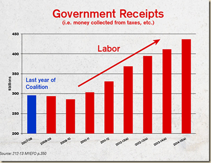
Rather surprisingly, over on Catallaxy, Sinclair Davidson has had a very little crack at me for finding fault with this graph by the Libs:
He thinks it “does a good job at dispelling the lie that the government has less money coming in”.
Which would be fine except that graph does not really just do that. By showing only one year of the LNP govt and then extending out to the end of the forward estimates the graph is clearly attempting to suggest there has been a boom in tax under the ALP.
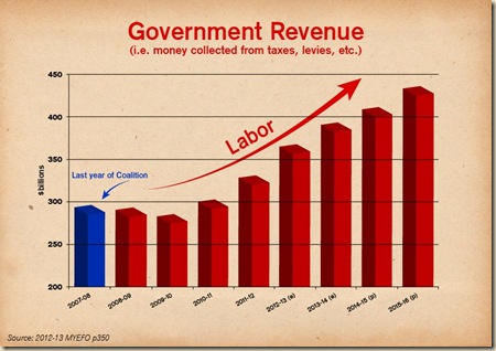
And just to show how dodgy the graph use is, the Libs have come up with a new version today:
Wow see that exponential upswing! And there’s an even added new bit of joy to discover! According to this graph tax revenue was actually lower (see that downward blue arrow) in 2007-08 than it was in 2008-09. Astonishingly $294.9 billion is now LESS than $292.6 billion!! Gotta love budget finance done the Liberal Party way.
I have no problems with someone stating that nominal revenue (or even real revenue) has gone up under the ALP – hell I wrote a Drum post about it last week! But let’s not be so gullible as to think the Liberal Party (or ALP) are pitching their graphs on Facebook to economics professors. They’re pitching it to people who would be utterly bored with economics and anything to do with the budget. But when they see a graph like those above they are lulled into thinking – geez the ALP has gone off on a taxing hike after the low taxing Liberal Party lost office.
Sinclair I think is being far, far too generous about the Liberal Party’s intentions. A bit like a teacher who knows a student has got something wrong, but because he likes the student he marks the essay on the basis of what he believes they were really trying to say, rather than what they did.
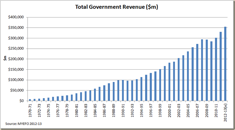
Personally I’m not so easily accepting of such a story, especially when you look at the increase in real revenue since 2000-01
As I noted in my Drum piece last week when I looked at revenue I used % of GDP. But I didn’t suggest a graph like this was the way to do it (which is my version of the Lib’s Facebook graph):
Instead I used this graph:
I think my graph is a pretty honest view of how things are. And I even posted this graph as well just to show I’m not locked in on only % of GDP terms:
I called out Julia Gillard for suggesting revenue has fallen, but I’ll also call out the Libs for suggesting revenue is zooming faster than what it has in the past.
The political party’s are engaged in spin. I don’t think it helps the debate much if we give them a free ride and even a pat on the back for doing so.


6 comments:
Thanks Greg, as usual your perspective tends to clarify the complex (mostly). However, I was taught in school - a very long time ago - that for graphs to be truly accurate and representative of the data, that you should use a 0 start point on the Y Axis. This way, we get a more accurate visual representation of what the numbers say. For example, if you (or the Liberal graph drawers), showed the Y Axis going from 0 to 450 for the first two graphs, then the upswing (and the downswing) would be more fairly and accurately demonstrated.
Granted, not as graphic and less able to support an argument, but I believe more truthful.
Robert - I agree for the most part with you re starting at zero. It is more honest, but also starting at zero can actually hide things - and suggest a flatness that really isn't there. Paul Krugman wrote a good thing on this here. As I note in my Drum piece - sometimes you need to go in for a close up - as I often do for example when looking at the unemployment rate. But it goes very much to intention - are you using that axis to show more clearly what is going on or to paint a distorted picture of what is going on.
I notice you linked to Larvatus Prodeo on your Drum post. When were they resurrected? Is it worth putting then back into your blog list?
Great post, by the way. As a maths teacher, the dishonesty in the use of some statistics and graphs is only matched by the politicians refusal to debate except with their own preferred measures. This afternoon on ABC in Melbourne, two pollies wouldn't debate - Lib just quoted an increase in net revenue from 2007 to 2012, whole Lab talked about % of GDP.
Raphael Epstein tried to get then to engage with each other's figures but both refused. They wouldn't even acknowledge that both figures were correct and debate which was more important. Dull and uninformative radio.
Thanks Michael. LP came back to life in March (I think). Good to see them back.
Yeah the debate gets pretty dumb.
Of course we won't mention the more than 3 million extra population.
Indeed anon.
Post a Comment